Stardust Studio Creates Animated HD Spot for Finnish Coffee Brand


“[Helsinki-based advertising agency SEK & GREY Oy] came to us with some comps they had presented to the client to get the account,” explains Alan Bibby, Creative Director. “Those comps already looked really beautiful so we were all really excited because they already had something beautiful as opposed to sometimes when you get handed something really ugly and have to make it look pretty.”
The agency had a detailed storyboard and issued the challenge to Stardust of creating a fantastical animated journey, while maintaining the elegance of the brand and its Finnish sensibility.
“They wanted to take the Presidentti coffee brand, which is the old, respected, a little bit staid, but high-end coffee brand and bring it into the 21st century to try and regain some market share without sacrificing the elegance or the perception as a high-end brand,” explains Alan Bibby, Creative Director. “All of their advertising before that would be like a gold ribbon floating through space while classical music plays. They wanted to try and update that without sacrificing the elegance.”
Creating elegance was easily understandable, but creating a look that was quintessentially Finnish was a little more difficult to conceptualize.
“They were really fixed on and they wanted to feel very Finnish, they didn’t want the look and feel to be that of another country because this is a very Finnish brand,” notes Bibby. “So we took those comps, did some research on what Finnish art looked like, what their culture is like, what Finnish trees look like ‘ that was a big thing. It all had to be iconic in some way of Finland.”
In the boards, the agency had detailed the various visual points it to be represented.
“They wanted a droplet that turns into a wave, and then fireworks that turn into a phoenix, a butterfly that turns into a flower, but then they left it up to us as far as the ideas, the transitions and translating it all into a seamless journey,” says Bibby.
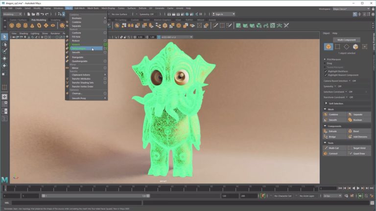
The animation was a combination of 2D and 3D animation using ReelFlow for the opening splash, Maya for the bulk of the animation, some 3DS Max, Trapcode Particular for the dust and other particle effects, Adobe After Effects, as well as traditional cel animation for the waterfall. Mental Ray was used for rendering.
“Initially we were going to use that for all of the water effects but in the end we ended up using Maya instead. ReelFlow looks like water, so when you try to push it into something that behaves in a more stylized fashion it starts becoming less useful,” says Bibby.
Maya was used for most of the work though they try to use 3DS Max on projects whenever they can these days because it is compatible with the V-Ray renderer by Chaos Group, says Bibby, noting “the look of V-Ray is very special.”
But creating the animation was only part of the challenge.
“Maybe the biggest obstacle was that we obviously had to get signoff for certain things before we could move on but within the timeframe we were working under we couldn’t do the [fully-rendered] shots more than once,” Bibby explains. “So managing this with an international client with a massive time difference and making sure those turnarounds was happening fast enough for the animators was difficult.”
The other challenge was creating this all in HD for theatrical display.
“The massive resolution is so much more of a pain. There’s a lot more attention to the details and obviously every revision and rendering it takes so much longer, but in the end it’s pretty rewarding to see it.”

Did you enjoy this article? Sign up to receive the StudioDaily Fix eletter containing the latest stories, including news, videos, interviews, reviews and more.


Leave a Reply