Keeping It Real in David O. Russell's Oscar-Nominated Film
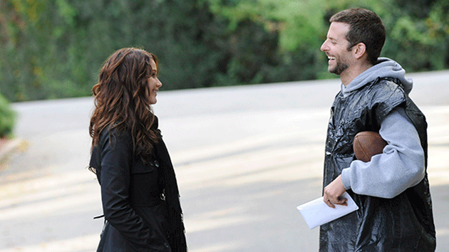
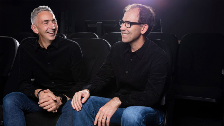
Silver Linings Playbook, directed by David O. Russell, stars Jennifer Lawrence, Bradley Cooper, Robert De Niro and Jacki Weaver. All of them are up for an Oscar this year, including the film for Best Picture. The acclaimed ensemble film was also an ensemble effort in the color suite. Graded by Tony Dustin, a digital intermediate colorist at Technicolor Hollywood and a longtime DaVinci user, Playbook marks Dustin's second collaboration with Russell. Most recently he has graded 50/50, the documentary Vito, and Safe Haven, in current release. We talked to Dustin about working alongside the director and Oscar-nominated editor to keep the film's looks in balance with the ups and downs of the two quixotic lead characters.
StudioDaily: You had worked with Russell before, grading The Fighter. Was this experience different?
Tony Dustin: Obviously, this time around we were more familiar with each other, but how we both approached things was very similar. They had different cinematographers, but both The Fighter and Silver Linings Playbook were shot on 35 mm 2-perf and both movies are extremely character-driven. As far as a a look is concerned, David is very clear that it must be real. He doesn't want anything to look too slick or fancy. He wants everything to have this organic, natural feel. In both cases we pushed it according to where we were in the story. The fight scenes, for example, in The Fighter. In Silver Linings Playbook, there were times where things needed to be more saturated and times when things needed to be undersaturated, following the story arc with color and contrast.

When you see the two leads outside, where they are more exposed emotionally, it has a cooler look. By the time they come into Tiffany's garage dance studio, with its bubblegum walls, there's a much warmer glow.
Exactly. That dance studio is a really good example, as that is the one area that we went back to quite a bit for reference, and it always had to be consistent. It's a very safe place for both characters, with the soft paint and warmer skin tones, and it was all very essential to get it right for the story arc.
Then you get the third act and the big dance contest, [where] it's all about exaggerated lighting that sets a heightened mood.
The dance was lit with a lot of purple, which was actually a very difficult thing to color-correct, because that actual color of purple, when you're color-grading for film, is difficult to achieve. Through video previews they were able to achieve that color but when it came to treating the film, it was a little more problematic and had to have some work done to it to get it right. Once again, that purple and red and blue had to be very, very specific and David was adamant that we hit it exactly.

What did you do during the scenes in Pat's childhood home — which feels like you are stepping back in time?
That's where the realism comes in. It had to be somebody's home that they had lived in for 30 or 40 years or more. At the same time, every time we came back there, it had to look just a little bit different, depending on the mood and the arc. It alternated from a stronger yellowish tone to a cooler tone and back again.
So that emotional temperature in the story was a very real gauge for the way you set your looks. Where do you think this works the best?
I still come back now and look at the dance studio scenes. I just love, love, love the way it looks in there. I also love the diner scene, where the characters have their first "date/undate." What was nice about working on that scene was that you are dealing with this warm look outside, but once you get inside the diner, everything goes cool. Jay Cassidy, the editor, who is nominated for an Oscar with Crispin Struthers, had significant input on the color decisions. It was a really great experience for me, because it's not often that I have access to the editor. They are usually cutting and recutting while I'm doing color-corrections, though I usually have the director and the DP. In this case I had the editor there with me as much, if not more, than David. It was really interesting to learn how he sees things and learn more about how the story is put together and how we can use color to help that. In the diner, you've got two characters that are having this super-emotional meeting of the minds in close proximity. Keeping it cooler underscores that.

Are you still grading mostly film for film-out, or has there been a noticeable shift recently?
Definitely more digital. I did 11 or 12 films last year and only two, maybe three were film. I had a lot of shows shot on Alexa last year.
Has that changed the way you work?
As far as the originating material, I'm finding that it is not changing the way I work much. What is changing is the transition from film theatrical release to D-Cinema release. Based on our projects at Technicolor, I'd guess we're now at about 90% digital release and 10% film. That transition, in terms of the workflow, has been challenging because finishing for D-Cinema is a different color space and involves a different technique.
Is it hard to move between the two, and which do you prefer?
Oh, wow, it's so hard to say. Film is beautiful, and I really loved working on scanned film and outputting back to film. But at the same time, there's just a lot of fun stuff you can do going completely digital that was never possible on film.
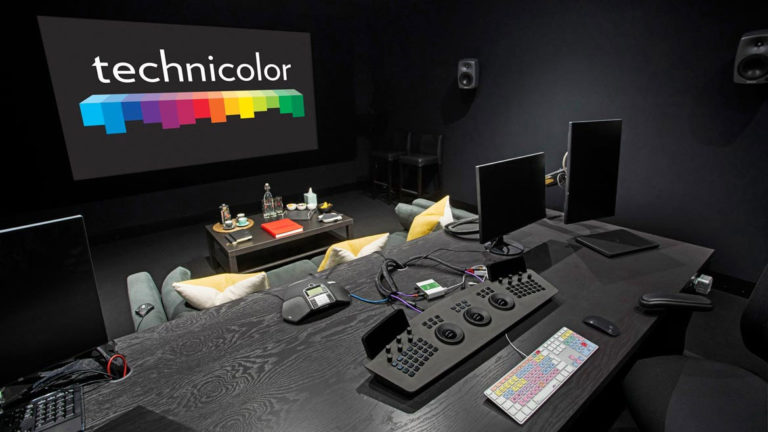
You graded this film on Resolve. What's your current setup?
I'm now on a Linux-based Resolve, version 9.1. I'm not sure [of] the processing power, but it's a lot. I believe when I graded Silver Linings I was using version 8. I use a combination of Resolve software and hardware, with the Resolve control surface.
What do you like about the upgrade?
I really like the new panel. It's fantastic. Right now I'm playing with some Red HDRx footage, and it does a great job of decoding it, as well as ARRIRAW. On another film I used the noise-reduction capabilities that Resolve has now. I can't complain. It's fast, it is very stable, and it rarely crashes. I've been a DaVinci user for a very long time, and started using Resolve early on. I can use Baselight and Lustre, but my personal preference is Resolve.
I have to ask: After you wrapped Silver Linings Playbook, did everyone get a plate of "homemades and crabby snacks"?
Actually, I still don't quite know what homemades and crabby snacks are. I asked David that direct question and he just laughed it off and said, "It's a Philly thing." But I still didn't get an answer.
Photos courtesy The Weinstein Company
Did you enjoy this article? Sign up to receive the StudioDaily Fix eletter containing the latest stories, including news, videos, interviews, reviews and more.


Leave a Reply