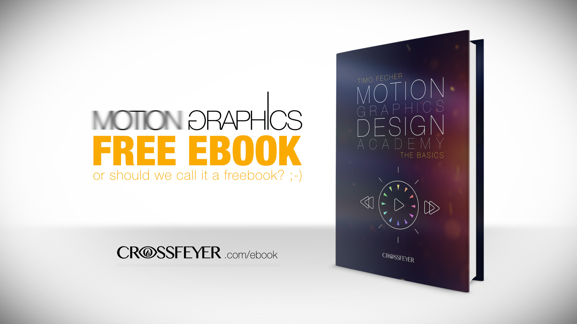
Motion-design artist Timo Fecher is releasing a free 200-page ebook, Motion Graphics Design Academy: The Basics, covering principles of motion graphic design. All he asks in return is that you sign up for his free email newsletter; the book is coming later this year. Fecher agreed to provide a free pre-publication preview, no strings attached, for StudioDaily readers. Enjoy this look at the effective use of color in motion-graphic design!
You're an artist? A storyteller? A filmmaker? You love graphic design and want to learn the high art of animation? The Motion Graphics Design Academy is an in-depth look at the production of impressive animations. It includes descriptions of a complex design process from classical static design theory to modern animation techniques. With the combination of professional knowledge and appealing storytelling you’ll be able to improve your artistic skills and to impress your clients and audience!
Watch Fecher's trailer for the e-book.
Narrating with Colors
Let’s talk about colors! You can have the best composition with marvelous design elements, great typography and convincing motion. Nevertheless, your motion graphic will still be a failure if the colors you have used don’t fit together or don’t support the overall message of your design. Colors are important! Their impact on your audience shouldn’t be taken lightly. Although not everyone is a professional in color theory, almost everyone has a subjective opinion towards colorations, which has a huge influence on the success of your work. This is going to be colorful!
The Influence of Colors
 Different colors exert different influences on their spectators. They can evoke emotions and can contribute to support a certain feeling. That’s why the effects of colors are so essential for every art form. The way a color influences the viewer depends on several facts. At first, there is the personal relationship to a color that everyone of us has established over time. This process already begins in earliest childhood, when we start to discover our environment. One simple example: From the very beginning, you get to know green as the color of nature. If you used to play on fresh grass as a baby, you probably still have a positive feeling towards that color that has subconsciously settled itself into your mind. Even today, you still link things that are green to positive experiences from your childhood and you automatically tend to like them. I have mentioned that different people will have another attitude toward a certain color. I hope that this didn’t happen to you, but I’m pretty sure that everyone who has been bitten by a bilious green snake has a different feeling when seeing green. The majority will see colors the way we will learn here, but there will always be exceptions and personal preferences when it comes to color schemes.
 The perception of colors is also influenced by cultural, political and religious backgrounds. In many countries, the color white stands for innocence and purity. In some Asian countries, it is the color of grief and death. Similarly we often associate colors with a certain religious movement, political party or famous brand. I don’t want to say that you should never use a color that can be associated to something. But I want you to remember that in specific cases, depending on your project, some colors might be inappropriate. Always know your target audience and try to understand their backgrounds and the culture they live in to avoid being misunderstood. The age of your audience also plays a part. Generally, a design for younger viewers can be much more colorful than the design for an older audience.
What else do you have to keep in mind while working with colors? Color temperature is an essential aspect. We have cold (blue, green, etc.) and warm (orange, red, etc.) colors. What is the color temperature that fits your design? If you are working on a commercial for the newest solar thermal system (which is a nice thing to have) you should probably stick to warm colors, as opposed to if you are working on a commercial for a mini fridge (which is also a nice thing to have — especially if it’s within reach, waiting for you to open it), where the usage of cold colors will serve you well. Every theme has its own temperature. Try to measure it as soon as possible.
Another aspect to consider is the arrangement of colors, and how much color is being applied. You should find the suitable amount of color and decide how you are going to arrange it according to the message you want to tell. Less is often more! Don’t go overboard with colors! Designs that are exceedingly colorful tend to sink into chaos and have a cheap character. Neutral areas in black, white or a shade of grey (there are more than just 50) will help you keep order and stabilize your design. Speaking of stabilization, the rules of balance also come into play: Balance out your colors! Warm colors have more visual weight than cold colors. So if you create a cold, blue area on just one side of your design, you could balance your composition with a warm element on the other side. And, according to the rules of visual weight, the warm element can be much smaller than the cold one and still achieve a balance. That way you can try out different arrangements and judge them by their visual weights. If you want to work with just one color, try to use different shades of it and keep an eye on the visual weight. The more saturation your color has, the higher its visual weight will be. So you could balance out a huge blue area with little saturation on the one side with a small blue area with a higher amount of saturation on the other side.
While combining different colors within your design, you should keep in mind that you also combine the different meanings of these colors. Therefore, a combination of two, three or even more colors always tells another story than just one color would. Color combinations are a great way to build contrasts and therefore create tension that can tremendously improve your motion graphic. When working with elements like photos or footage, try to continue their coloration within the rest of your design elements or create harmonic contrasts for an overarching consistent image. Never put an element into your design that you can’t align with the rest of your work concerning its look and especially its coloration.
Strategically assigning colors to different objects can also help you to establish recognition for them and show unity where it can’t otherwise be done, by positioning objects next to each other. For example, by consequently coloring your headlines green, you can declare the color green as the color of your headlines. In a short time your audience will accept that fact and therefore identify green text as a valuable headline. That creates recognition for your headlines and makes it much easier for your audience to follow and understand your work. With colors it is also possible to group objects that are indeed in the same composition, but that aren’t positioned next to each other. Giving these objects the same color shows that they belong together.
The goal of the eBook is to give its readers a profound background knowledge about design and animation principles and to improve their artistic skills. Software and plug-ins are changing constantly. But all that theory about storytelling, animation, color, typefaces, composition & compositing will stay the same.
To continue reading and learn more about Graphic and Motion Design, you can preorder the free eBook here.
![]()
Did you enjoy this article? Sign up to receive the StudioDaily Fix eletter containing the latest stories, including news, videos, interviews, reviews and more.

Leave a Reply