Accenting Color and Avoiding ‘Normal’ in 4K HDR
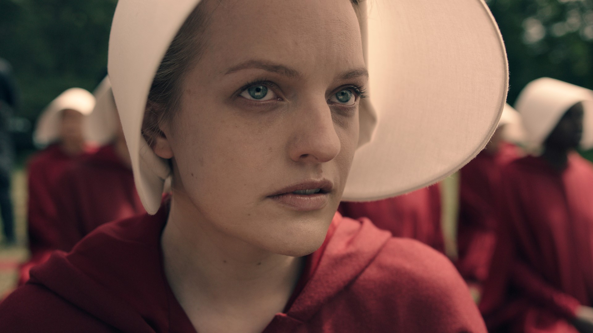
Airing on Hulu in the U.S. and Bravo in Canada, The Handmaid’s Tale is based on Margaret Atwood’s highly influential 1985 speculative-fiction novel. Set in a totalitarian near-future version of the U.S. known as the Republic of Gilead, it takes place in a society that has classified women as state property. Adapting Atwood’s dystopian story to the screen demanded a smart, subtle palette that would convey the bleakness of its world without forsaking color entirely.
The show was mastered in Dolby Vision at Deluxe Toronto, where care was taken to balance the extended dynamic range and highlights that can be reproduced in HDR with the more subdued visual requirements of the show’s mood and subject matter. Deluxe Toronto colorist Bill Ferwerda collaborated with Reed Morano, who directed the first three episodes, director of photography Colin Watkinson, and on-set color-grader Ben Whaley to take the best and most appropriate advantage of HDR for the product.
In statements provided by Deluxe, Watkinson and Ferwerda discussed how the color decisions were made in a workflow that followed Dolby Vision’s recommended process, using Dolby’s content mapping unit (CMU) to allow the HDR color grade to be mapped to an SDR environment for comparison’s sake.
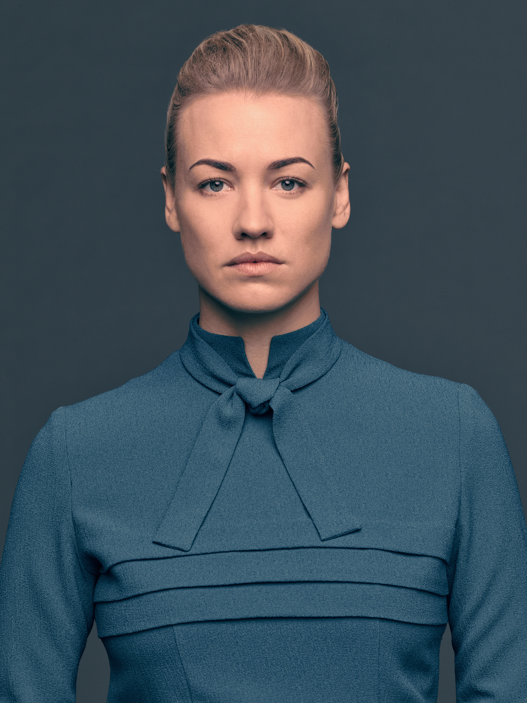
Yvonne Strahovski, in peacock-blue dress.
Jill Greenberg/Hulu
“The color red needed to stand out and be significant. Everything in the production design, from the color of the houses to the specific peacock blue of the wives’ wardrobe, was selected really carefully. Bill [Ferwerda] and Ben [Whaley] did their homework around this new format and they made sure the look and intent were perfectly preserved. Everyone involved in making this show put their hearts and souls into it. It’s been an extraordinary experience.” — Colin Watkinson, DP
“In the HDR grade, we took the muted look and keyed back the red and cyan to accentuate key colors. We would also emphasize an object art-directed in the shot — a vase or a flower — for a punch of color. Elisabeth Moss does a lot of acting with her eyes. We have paid special attention to that, making sure her eyes are always visible and bright. [The look is] very painterly and velvety. Colin’s lighting and mood were just gorgeous. Out of the gate it looked fantastic — you can stop on just about any still and it feels like a painting. It’s really an unusual look. So in HDR, if anything started to feel too real, too normal, we worked to inject different colors into the blacks or highlights. Blacks floated a bit higher on this show than they normally do. Dolby Vision allows you to control both [HDR and SDR] environments. When you map SDR from HDR, you have trim functions to match. We just respected all SDR boundaries when we worked in HDR. There’s plenty of flexibility to take a look as far as you’d like or to keep it dialed back.” — Bill Ferwerda, colorist
Deluxe: www.bydeluxe.com
Did you enjoy this article? Sign up to receive the StudioDaily Fix eletter containing the latest stories, including news, videos, interviews, reviews and more.


So, they went through all that and then Hulu streams it at 720p without even surround sound audio… Great show, but come-on Hulu, time to up your streaming quality.