Joyce N. Ho and Nidia Dias offer a behind-the-scenes look at a global collaboration.
For 16 years, Semi-Permanent has been bringing together artists from all over the globe for a three-day design conference devoted to sharing experiences and ideas. The event’s title sequence is a key part of the action. And each year one director is chosen for the coveted job, which offers both copious amounts of creative freedom, and the stress that goes with it, as well as the chance to share your work with a community of extraordinary peers.
Hong Kong-born, New York-based designer Joyce N. Ho directed Semi-Permanent’s 2018 titles, the theme being “creative tension as inspiration.” The first female director in the conference’s history, Ho assembled a team of 11 collaborators who worked remotely from around the globe, including designer and art director and Nidia Dias, who used Maxon Cinema 4D and Redshift, Adobe After Effects and Insydium X-Particles for Act III of the sequence.
I asked Ho and Dias to break down the widely praised, otherworldly title sequence, which was made in partnership with Dropbox, including explaining how the titles were inspired by the work of Ernst Haeckel, a German professor and biologist known for discovering and naming thousands of new species while also helping to visually promote Charles Darwin’s theories of evolution.

Ho was inspired by these and other plates from Ernst Haeckel’s Kunstformen der Natur (Artforms of nature).
Courtesy of Wikimedia Commons: https://commons.wikimedia.org/wiki/Kunstformen_der_Natur
StudioDaily: Joyce, how did you get the job of creating the 2018 titles?
JNH: I actually reached out to the founder of Semi-Permanent, Murray Bell. Since going freelance and moving to New York from Australia, where I grew up, I’ve made it a personal goal to try to direct something every year. Last year, I did titles for Likeminds, and Semi-Permanent has always been a part of my design life. Every year they do such amazing title sequences by a lot of designers I really look up to, so I thought, “Wouldn’t it be cool if I could direct the titles?” So I sent Murray an email last year, explaining who I am and that I’d love to do the titles. I didn’t expect to hear anything back, but he got back to me a few weeks later to say that Framestore was doing them for 2017, but he would like me to do them next year.

Joyce N. Ho moved to New York City from Brisbane after falling in love with the city while visiting with her best friend years earlier. Happily, she’s found the motion community to be really friendly and welcoming.
I was just over the moon. I couldn’t believe it. I found out later that Murray is very into the idea that there are signs leading up to something happening. In this case, he had asked a few designers who he should think about for 2018, and Raoul Marks and Patrick Clair recommended me. He took that as a sign because he’d already started doing some research on me on the internet, and then I emailed and he took that as a third sign and gave me the job.

Committed to doing something that would really stand out design-wise from previous years, Ho chose an intense, vibrant color palette and created an abstract story intended to be creative and fun.
Talk a bit about your background and how you became a motion designer.
JNH: I was born in Hong Kong and my family moved to Brisbane, Australia, when I was 4. I’ve always loved watching TV, and I think that’s how I got introduced to animation — just watching a bunch of cartoons and also drawing and making things. After high school, I went to Queensland University of Technology and majored in animation. Once I discovered motion design, though, I realized that was for me. My first job was as a junior designer at an agency. Soon after I started, they opened a sister company that primarily did motion design, and I was the first employee in the new studio. I really liked it, and I stayed for about seven years. By then I was a creative lead and had learned all about how a studio runs, how to pitch jobs and all kinds of other things you don’t learn at university. Most of all, I realized that what I loved most was concepting. When you find a crazy idea that you think might work, and then find ways to make that come to life on screen, I love that.

Ho created this shot for Act II in which the organism is actively growing. Though it was created in After Effects, many people have mistakenly thought this was 3D. “The blur on this is totally fake, but it gives it so much depth, it feels like 3D,” she explains.
Nidia, tell me about you. And did you know Joyce before this project?
Nidia Dias: I’m a designer and art director. I grew up in Portugal, but I’m living in Toronto right now. I’ve always liked to draw, but I went to engineering school for one year before realizing it was completely not what I wanted. So I studied graphic design for three years, and then discovered motion design. I did a lot of tutorials online, first After Effects and then Cinema 4D. Next, I studied motion design at Hyper Island, and then I took an internship with Mainframe in London as part of my degree.

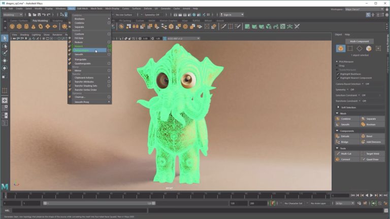
Believing that things “don’t actually need to be complex to look complicated and interesting,” Nidia Dias simply extruded spikes on a sphere with a bevel and rotated them to bring the jellyfish-like creature she made to life.
I was in London for seven years, and worked as a senior designer at FutureDeluxe and as an art director at Analog Studio. I moved to Canada in 2017 to work at Tendril, where I am mostly an art director, and I also do style frames and motion design pieces. I still do some freelance work, like the Semi-Permanent titles. I didn’t know Joyce, but I’d seen her work. So when she contacted me to help her out, I thought, “Yeah, this is an interesting project. Let’s do it.”

Nidia Dias focuses primarily on style frames and look development for motion, and also creates illustrations for print. Her clients include Adidas, Nike, MTV, Intel and Universal Music.
Joyce, what kind of direction did you get from Murray Bell?
JNH: The titles needed to speak to the idea of creative tension, and Murray explained what that theme meant to him. After the initial call, I broke down his explanation of creative tension, always thinking about how to tell the story while allowing enough room for other people’s ideas. We only had three months, so it was a big puzzle to solve. Murray also wanted the 2018 titles to be little bit different. Semi-Permanent had a bigger partnership with Dropbox, so they asked me to organize a grand collaboration between artists who work in 3D, design, motion graphics and music. I would be the director and we would use Dropbox to work together remotely. I had free rein to choose my team, which is such a rarity and a wonderful opportunity to work with designers I really admired. It was great, too, that they had Ways & Means make a four-part behind-the-scenes video documentary of the titles. That was such a cherry on top of everything. I didn’t expect that, and it’s really been a great opportunity.
I knew I wanted to center the direction around nature and science because they’re such a huge inspiration to me. While doing research the old-fashioned way at the New York Public Library, I found Artforms in Nature by Ernst Haeckel. He did beautiful illustrations of micro-organisms and algae and creatures from the sea. I was so inspired, and I knew right away that those would be my key references. I wrote a treatment with three acts: Pushing and Pulling, Friction, and Release. I thought about how I wanted to visualize each section and then broke down each act into style frames.
I gave those style frames, and a base music track I was working with, to the collaborators I reached out to. Lucky for me about 90 percent of the people I asked to participate said yes. They had the latitude to interpret what I gave them, and I was super open to them bringing in their own sense of style, as long as it kept with color palette and what my idea of what the shot needed to be.
Describe what happens in the titles.
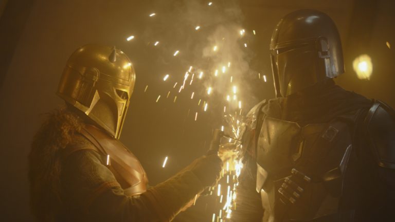
JNH: It’s a microscopic world inspired by Haeckel. You follow the organisms from birth to death, and the three acts are really stages of creative tension. The beginning is all about the time when creative concepts are forming. We shot in 4K, so we were able to zoom in and follow the sphere, which was half a Styrofoam ball. I composited a digital sphere later. Act II represents aspects of a project that can cause conflicts, like deadlines and budgets.

For the most difficult shot, 15 seconds into the titles, Ho and artist Davy Evans used a Styrofoam ball, paint and magnets to create a sphere moving across a liquid background.
There’s friction in the process at this point, and I showed that using the principle of cell division. This act represents multiple aspects of a project that may be causing conflict; whether it be the timeline or the budget or the actual project itself, it’s where things are evolving and sometimes not working out the way you want it to — that little bit of friction in the creative process. And yes, I felt like I was living out all these stages through the creation of the titles in real life! Nidia created the first half of Act III, which represents the micro-organism, or idea, in its most complex form. At this point, I wanted the organism to have tentacles, which turned out to be challenging. She definitely had one of the toughest 3D shots.
Nidia, explain what you created to visualize “Release” for Act III.
ND: Joyce knew what she wanted from the start, which was great, and the music was done so it was easy to put things to the beat. My job was to make something that looked like a living organism. Joyce gave me a bunch of Ernst Haeckel references, and I combined a lot of what I saw into one fake 3D organism, which I wanted to look a bit like a jellyfish. I started by doing an animatic and motion tests to get the movement right before I modeled something. I used [C4D’s] MoGraph, the bevel deformer and a few other deformers to make the organism look like it was alive, but my main challenge was getting the motion right. (Watch Dias’ breakdown video.)

Nidia Dias used Cinema 4D to model the jellyfish-like creature for the “Release” portion of the titles. Rendered using Redshift, the top blue part of the creature was created with Merk Vilson’s Trypogen plugin for C4D.
JNH: The difficult thing with the tentacles was that they looked great from the side, but when we placed the camera above them, they didn’t have the depth we wanted. I animated them in 2D using a rigged Newton [a 2D physics simulator] joint, and then Nidia comped those into the 3D shot in Cinema [4D]. It was a really good example of how we all worked together, combining different mediums, to work things out.
ND: I also collaborated with Joyce on the tunnel shot where everything feels like it is being pulled into a vortex. I used X-Particles to for a few variations of the tunnel, which was emitting little circles from my previous shot. I layered my C4D file in After Effects, so that Joyce could use [it] to make the tunnel look so painterly. I had a great time working on this project. Joyce’s art direction was beautiful, and I loved the color palette and that everybody was able to bring in their own style.

Ho used the After Effects plugin Trapcode Mir for the tunnel vortex, which was a collaborative effort between her, Dias and Davy Evans.
Joyce, music is so vital to these titles. Explain how you worked with Ambrose Yu.
JNH: I’ve always been a fan of Ambrose’s music, but I’d never worked with him before. He did an amazing job. I gave him a few reference tracks and the brief, which explained my idea of being playful and fun before building up to a big ending. He pretty much nailed it on his first demo, so the final music you hear is about 80 percent what he sent me the first time. I think music is such an important part of motion, I had him send it to me very early on when I was working on style frames. That really helped me wrap the story around the music.
How do you see your career evolving?
JNH: Currently, as a freelancer, I do a whole wide range of stuff. I specialize in art direction for motion, and I really like to direct my own projects. Title design is something I’ve very interested in and what to keep doing. I enjoyed the puzzle aspect of this project so much. Completing such a mammoth project and being able to work with so many designers whom I’ve really admired from afar, was so amazing. It was a rare opportunity and very much a dream project that means a lot to me personally and as a designer.
Credits:
Direction and Production: Joyce N. Ho
Music & Sound Design: Ambrose Yu
Type Design & Animation: Worship Audio
Design & Animation: William Arnold. Nidia Dias, Joyce N. Ho, Somei Sun, Joel Watkins
Cinematography: Davy Evans
Edit: Alex Gee
Storyboard: Mercy Lomelin
Additional Animation: Hayato Yamane
Special Thanks: Murray Bell, Patrick Clair, Jonathan Kim, Dropbox
Crafts: VFX/Animation
Sections: Creativity
Topics: Project/Case study Q&A joyce ho semi-permanent titles
Did you enjoy this article? Sign up to receive the StudioDaily Fix eletter containing the latest stories, including news, videos, interviews, reviews and more.