Colorist Jean-Clement Soret on Low-Budget, High Impact Color Grading
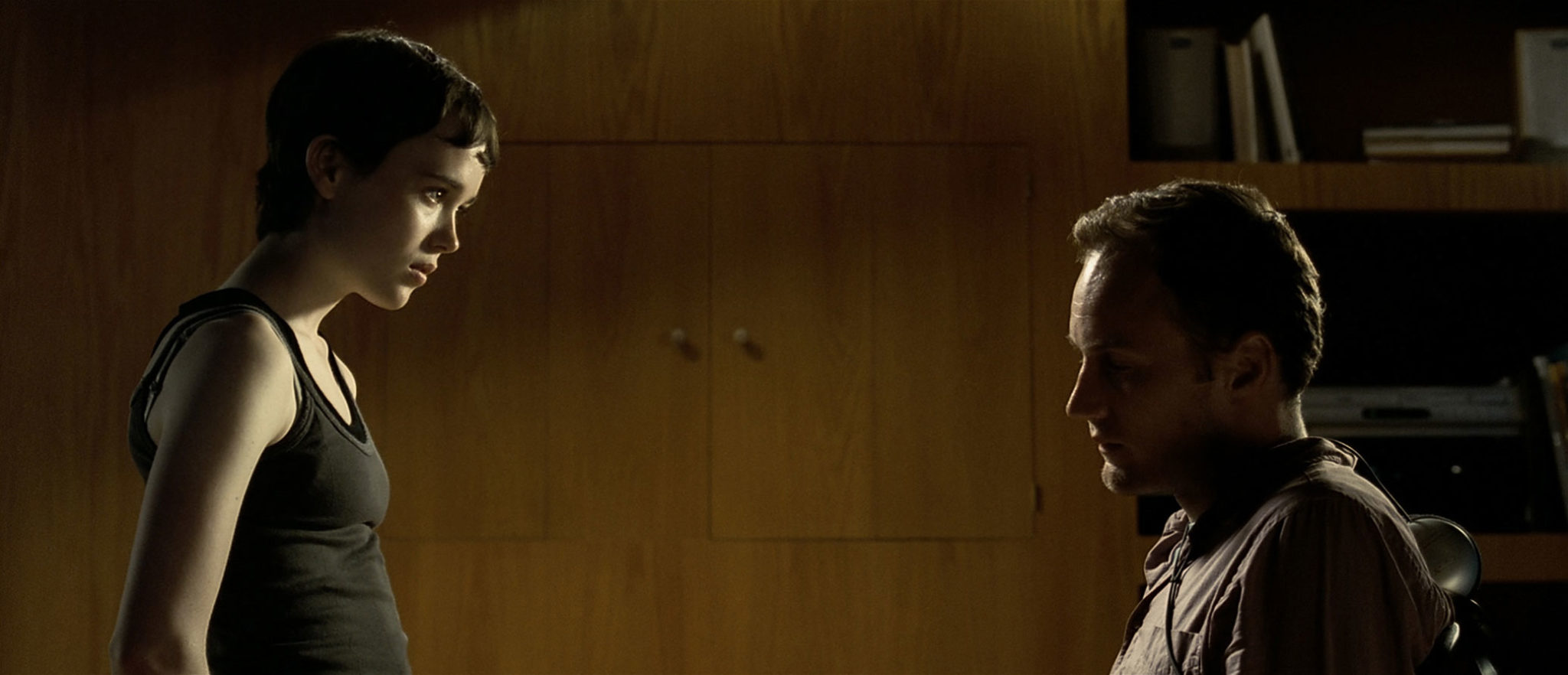
If you’re in the mood to be unnerved, you can’t do much better than Hard Candy, a tense two-hander about a photographer and the teenaged chat-room flirt he invites home with him — and who gives him a whole lot more than he bargained for. Director David Slade’s psychological thriller, opening in the U.S. on April 14, is one of the first movies to credit its digital colorist — Jean-Clément Soret of London’s Moving Picture Company — in the opening titles instead of the end credit scroll, which offers a clue as to just how important Slade thought the film’s DI really was.
Soret was an old collaborator of Slade’s on commercials and music videos, brought in to help execute some complicated color work. At a roundtable interview promoting the film, Slade said the color decisions depended on the film’s performances. “If the performances were not convincing, you would see those colors very clearly as colors,” he said. “I believe most people who watch this film feel those colors rather than see them because the performances are so strong. The degree to how expressionistic you can be as a director is determined by how realistic they are as actors. The more convincing they are, the more transparent the form between the viewer and the performances becomes.”
The film was made for less than $1 million, and Slade notes with some pride that the figure included the delivery of a finished, digitally graded negative that was ready for striking theatrical prints — distributor Lion’s Gate didn’t have to kick in any extra money to finish it. We talked to Soret, whose screen credit suddenly makes him one of the best-known names in the DI business, about his work on Hard Candy.
Q: How was the DI accomplished in keeping with the low budget?
A: David and I thought about how we were going to do that. Normally with DI, you scan film and then you use a software-based system, working disk to disk. But because David and I had been working together for a few years using a lot of telecine, secondary color grading, he wanted very much to use that as a creative tool. He was a bit afraid of the limitations of currently available systems. We have the Quantel iQ here, but he really wanted to work directly from the negative rather than from a disk. When you scan material, you do a “safe grade,” and that, in theory, has all the information that you have on the negative, but you know that you’re working on less bit depth than if you were working directly on the negative. Also, David wanted to play with tools like contour correction, which is only available on the Spirit. At the end, he really wanted to work in a very traditional way, which is cutting the negative overlength [with handles] and then grading the film like we would grade a commercial.
Q: Because it was a way of working that he was very comfortable with?
A: It was purely for creative reasons. David wanted to push the colors certain ways. He had a set that was painted a certain color, and sometimes we’d change the color completely, and lighten or darken some colors as opposed to some others, and that is quite difficult to achieve. When you go extreme, you need as much resolution and bit depth as possible. So working directly on the negative allowed us to do that. Overall, it was probably more painful than scanning, conforming, and then doing software grading. But creatively, it was more interesting. Definitely.
Q: What resolution did you work at?
A:We did the project in HD because we needed [to work in] real time. Doing it in 2K wasn’t really an option, given the amount of material we had. Also, being in real time was great for using all the tools we had like grain reduction and dust-busting.
Q: Were the color decisions made in the DI process, or had the director made them during production?
A: There were some things we talked about. I said, “The darkness or brightness of some colors, like the walls or skin tones, is difficult to change, so you have to choose a good median point or we won’t be able to do what you want to do.” He had used, in the past, techniques like painting the actors’ skin with blue or green makeup to be able to isolate them — once they’re isolated you can manipulate everything else but them. But I thought it was risky, especially in close-up and on the big screen. It’s a technique that works in music videos, but it would probably be too extreme in a feature film. What David wanted to achieve was to help the story, and create an atmosphere. Coloring is to the image what sound design is to sound — all these little things that you can hear, or you can see, but are not in your face. For example, we played a bit with the sharpness. When the action is a bit violent, when Hayley attacks Jeff, we used a lot of sharpness to make the image very aggressive. And that went well with the narrow shutter angle he used in the camera.
Q: You’re possibly the only colorist I’ve seen credited in a film’s opening titles. How did that happen?
A: I was really surprised. There wasn’t really a budget for [the DI], but we had been talking about this for years. When we were talking about music videos or commercials, we’d say, “When you do your movie, we’ll do this.” When he came, finally, with his first movie, I wasn’t going to say, “You haven’t got the money — we won’t do it.” So we did it for the money they had. They had planned in advance, so they had something. But it was just a thank-you from David for that huge favor we did for him. And I think he’s very visual, and to him the image is very important.
Q: What was the biggest challenge on Hard Candy?
A: Because we weren’t working in the normal way, where you scan and then you conform and then you grade, we had cut negative, and some of the takes were used several times, or different parts [of the same take] were used. So the negative wasn’t quite cut in the order of the edit ‘ because some takes couldn’t be cut. Grading-wise, trying to work out what the progression of the grading should be if you had it in the right order was a challenge. You have to work out which shot comes after which other one, and then work on them according to how they are going to end up in the conform. The other challenge was to do the dust-busting, since we had been using the original negative. After spending three weeks running it back and forth on the telecine, there were speckles all over it. It was either doing everything by hand, which would have taken months, or using a prototype piece of kit that did all the dust-busting in real time in HD [the Digital Vision DVNR1000-HD]. They let us have it for a week to evaluate it, and we told them we would buy it if it did the job. It took a while to get it to work properly, but it did the whole job in a couple of hours.
Q: What are the biggest issues facing you as a colorist?
A: I’m not sure the grading is the biggest issue. It’s everything else. To deal with a cut that’s constantly changing, and applying the grading so far to the edit. Also, the dust-busting takes a while. We can do it in real time in HD, but when we’re in the normal DI workflow we’re at 2K and can’t do it in real time, so that’s always a bit of a problem. There’s no system that is absolutely ideal. The iQ is great for deliveries, for instance, because it can ingest or output any format in real time. But it could improve a lot on the interface and the GUI and the ease of use. It’s not really colorist-friendly. I find Lustre a lot easier to use. It’s more colorist-friendly, but it’s not very good on the editing side and in delivery. Any system has its pros and cons. There’s always a part of the workflow that’s going to be difficult because nobody has a system that does it all.
Q: I’ve read you’re working on a film called Sunshine. What can you tell me about that?
A: It’s Danny Boyle’s next movie. I don’t know very much about it. It’s shot on all different type of formats — there’s 35mm and there’s also HD and HDV.
Q: You’ve got some experience making low-resolution formats look good from 28 Days Later.
A: That was done for budgetary reasons. I think this time the mix of different resolutions is part of the story. The pristine, clear 35mm is going to be used in outer space. It’s about a long trip toward the sun, and I think the inside of the spaceship may be shot on a lower-resolution camera, maybe HD or HDV. There might be some material scanned at 4K as well.
Q: So might that present some new workflow issues?
A: Not that much, because the iQ is really good. You can mix different resolutions on the same timeline, and that’s a real plus for us. I haven’t been working on many features lately because the DI business is still very much in its early stages. We take it very seriously, but it’s difficult for me to be taken off commercials for two weeks or a month to go do a movie, so it really only happens when there’s a nice opportunity — like a Danny Boyle film.
Sections: Creativity Technology
Topics: Feature Project/Case study
Did you enjoy this article? Sign up to receive the StudioDaily Fix eletter containing the latest stories, including news, videos, interviews, reviews and more.

Leave a Reply