Using Film Grain, Color and Inventive Framing to Capture a Period Love Story
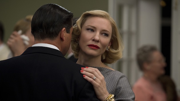
Carol, a likely Oscar contender with Cate Blanchett in the title role, has been picking up critical momentum, recently sweeping the The New York Film Critics Circle Awards where the film, director Todd Haynes, screenwriter Phyllis Nagy and cinematographer Ed Lachman, ASC, were all recognized.
A beautifully rendered film about a married socialite (Blanchett) and a shop-clerk-turned-photographer (Rooney Mara) who fall in love in 1952 New York, Carol is a study in emotionally visceral camerawork on film — something Lachman and Haynes have done, to very different effect, in I'm Not There and Far From Heaven, for which Lachman was nominated for an Oscar. But Carol was not shot in the grand 35 mm tradition. As he did for Haynes' HBO period miniseries Mildred Pierce, Lachman shot the film in Super 16 with an Arriflex 416. We spoke with him after he'd just won the top Golden Frog from Camerimage, an international cinematography festival in Poland he regularly attends "to spend quality time with other cinematographers." He reflected on why he and Haynes chose Super 16 for Carol, the many non-Hollywood references that influenced his framing choices, and the importance of playing with color temperature in camera.

StudioDaily: Todd Haynes is famous for the dense "look books" he assembles prior to shooting a film. What were some of your primary references?
Ed Lachman: The idea was we were going to look at the time period of the early 1950s not through Hollywood cinema but through the language of mostly still imagery that more clearly reflected the social and cultural fabric of the time. We wanted to look at those feelings simmering beneath the surface in an urban reality, to situate the story in an emotional context. We started with the tone of Patricia Highsmith's book upon which the movie is based, The Price of Salt, later called Carol, which was really about first love and a coming of age story for the character of Therese. She is discovering herself and, through that, what true love is. It was a heartbreakingly honest narrative, so we really looked at a number of mid-century photographers and photojournalists who also happened to be women, like Ruth Orkin, Esther Bubley, Helen Levitt, and, later, Vivian Maier. These women shot mostly in black-and-white, but all eventually experimented with color and art photography. We explored the Ektachrome look, partly because we wanted to reflect the grittier times. This wasn't the high-gloss late 1950s of Far From Heaven, which was referencing high-flown Sirkian Hollywood melodramas. It was a very uncertain and unstable time in the American imagination, between the war and Eisenhower, and it was really the beginning of the Cold War and growing paranoia about the Soviet Union and its encroaching control of the Eastern Bloc countries. That's also why we shot it in Super 16. It was to reference the grain of that time in film. We couldn't look back at that time with digital or even 35mm film, which has become almost grain-less. It's too good. I really thought Super 16 captured a certain emotionality of the characters.
Did you look at any films from the period outside the mainstream?
Ruth Orkin worked with Morris Engel and made what today we'd call independent films. We looked at one in particular, called Lovers and Lollipops, to see how you situate the subjective viewpoint of the characters. In terms of framing, we also looked at Sol Leiter's still work. We really see Carol's world through Therese's eyes. Therese's mind in the book is kind of fractured and uncollated. So we see characters through windows and partially viewed in doorways. Also, it was a way to convey that the characters are not seeing themselves fully developed, which creates a feeling or emotion in the viewer.

How else did you deal with POV?
We really wanted to put the camera through things as much as possible to structure the point of view of the characters. Many times the audience is like an observer watching that character in their own personal prison within these different worlds. We wanted to shoot through all these enclosures and textures, like rain and dirty windows, to convey what's hidden. In all of her work, Patricia Highsmith has equated a kind of criminal existence to desire. From Strangers on a Train to The Talented Mr. Ripley, love is a crime and homosexual desire gets expressed as criminal acts. Later in the film there's dialogue in a scene shot through the windows of a car in which Carol is saying how sorry she is for involving Therese in the whole affair. You see from outside the car; they are both in their own private prisons but also are being viewed by the outside world as criminals, having just been surveilled in their most private, intimate moments by a private detective. The camera is dealing with this isolation of desire throughout the film and because they can't accept those enclosures, they continue to push through them toward something more honest and genuine. The other lesbian novels of that time were really self-punishing. The main characters either ended up in suicides or sanitariums. But The Price of Salt/Carol was the rare one that held the possibility that their relationship would succeed and endure.
The camera movement is very controlled throughout, but did you ever consider shooting without rigs?
I think it's a mistake to capture emotional realism with jerky handheld shots. We were instead documenting a certain reality and naturalism, but we felt we could do that by longer lensing and the spatial relationships we created between the characters and their surroundings. Unfortunately, I think it's become an overused technique to shoot handheld, and it's a fallacy to believe that it is somehow the only way to create a reality that people believe in. It's still a very stylized reality. But Sol Leiter was very instructive for us in the way he refracted a frame, interrupted the frame and abstracted a frame — it's a more truthful way, I think, to make you feel the characters' sense of displacement.

What did you most like about the Super 16 workflow, either on set or during the grade?
By shooting in Super 16 I feel it references the way film stocks looked 60-plus years ago. But also I felt the grain has an emotional quality. Film has a randomness in its grain structure between the frames. Also, the color separation is different in film than it is in the digital world. It is finer grain in highlights and larger grain in lower lights. For me, it's like a living organism, breathing almost, because the grain structure is in constant movement. It's hard to get close to that in the digital world, where each pixel is fixated in each frame. Even though you can now lay grain on the digital footage, it's still not random. It doesn't mirror the way film grain moves because of exposure. Todd and I felt it would have that anthropomorphic feeling of something living, and evolving, and worked toward the emotions of the characters. The grade was very interesting because film sees color differently from the way the digital world does. In film it doesn't mix. If I have a window with cool daylight around it outside and warmer light inside, I can get a distinct separation of those two spaces in the color temperature. You never see the mixture of the two. You get that in early color still photography, like Ektachrome, and it's something we were trying to emulate. There was a coolness to the negative mixed in with warmth. I felt I could recreate that much better on Super 16 than I could digitally.
Did you spend a lot of time fine-tuning images during color-correction?
When you go through a DI with Super 16 it almost enhances the image, so the only thing Todd did with me during the grade was if we felt the color was too saturated we muted the color a bit. I always start emulating the color in camera because I always play with gels. This time I played with a lot of magentas and greens and cool and warm colors. The older film stocks were more limited in their color spectrum so I was trying to create that soiled, soft look of the period that hadn't approached full-spectrum color yet. I also always play with color temperature, like daylight film in tungsten situations or tungsten film in daylight situations, when I shoot. I never felt that photography had to be naturalistic to a fault. I've always been interested in the interpretation of an expression of color. Color is never just decorative or even just representational. In my mind, it creates a psychological environment through which to view the characters.

Crafts: Shooting
Sections: Creativity
Topics: Article ed lachman oscars 2016 Ruth Orkin Sol Leiter super 16 todd haynes Vivian Maier
Did you enjoy this article? Sign up to receive the StudioDaily Fix eletter containing the latest stories, including news, videos, interviews, reviews and more.


Leave a Reply