American writer George R.R. Martin may be best known for having written the fantasy novels on which Game of Thrones is based. Now, fans are becoming aware of his talent for crafting science fiction with the release of Nightflyers, a 10-episode, outer space horror series that premiered on Syfy and is now on Netflix. Watch the trailer, below.

Hydroponics analysis screens inside the Nightflyer’s terraform dome.
Courtesy of SyFy
Based on Martin’s 1980s novella of the same name, Nightflyers tells the story of a team of scientists aboard a super-advanced spaceship, the Nightflyer. Their mission: make contact with alien life. Unfortunately for them, their high-tech ship is haunted in terrifying ways. Working on-set in Limerick, Ireland, with episode directors, set decorators and members of the art department, Territory Studio used primarily Maxon Cinema 4D and Adobe After Effects to create more than 1,200 motion graphics for on-set future tech, including screen content and user interfaces.


Two of the many different screens Territory created for the Nightflyer’s bridge.
Netflix
Working on the series nearly to the end, Territory supplied assets to the broader team to help with last-minute changes. They also collaborated with Kill2Birds on the series promo.
Territory’s Sam Keehan led the creative team working on the series’ UI and screen content and Sam Munnings, one of the studio’s senior motion designers, served as creative lead on the promo. Here, the two of them offer details about Territory’s work on both projects.
StudioDaily: You were brought in during pre-production. How did you collaborate with everyone?
Sam Keehan: Information and assets for the graphics came from many corners of the production. We worked closely with David Ingram in the art department, Naomi Moore and Andrew McCarthy in set decoration and Tara Doolan, the assistant to the directors, to achieve as much efficiency as possible. Communication was very open, so we were able to work quite quickly. We often had only days to get graphics done, so pooling information in this way allowed for directors to give us feedback practically instantly.


Soon after boarding, strange and unexplainable things begin happening to the Nightflyer crew.
Netflix
What kind of direction did you get?
SK: There was a broad range of sets on the spaceship: medical labs, a mess hall, cargo bays and even a hydroponics lab. We needed to make sure the graphics supported the story and action and helped explain plot points. We designed the ship’s technology interfaces to perform many different tasks as efficiently as possible. Our system allowed the directors maximum flexibility to use screens as textural background and, at the press of a hotkey, display specific story beats, before settling back into its background state.

The status of the engine and thrusters are shown on screen in Karl D’Branin’s life pod.
Courtesy of SyFy
Territory has worked on many high-profile films. How was this project different?
SK: We worked closely with local contacts on the ground to establish a studio and got up and running quite quickly. It was definitely a great advantage to have a fully functioning studio that was so close to the set. One interesting difference was that our designs needed to work for each director on the show. Normally, you have a core team you deal with throughout the production. In this case, we had a core team but there were different directors for most of the episodes. So we created a malleable design that could encompass the different ideas and ways of working that we encountered across the series, while still ensuring visual cohesion throughout.

Screens in the ship’s medical lab were used to illustrate many different aspects of the plot as it developed.
Courtesy of SyFy
In creating our various animations, we are constantly juggling and maneuvering between Cinema 4D and After effects. They have a symbiotic relationship for us, and it was rare when we didn’t have an asset that incorporated elements created in both. We would often render out several passes of various hero 3D objects and composite them together to make hero elements of story beats or textural elements to break up structure where needed. The bridge screens exemplify that relationship perfectly.

Vessel diagnostics are monitored on one of the consoles on the ship’s bridge.
Courtesy of Syfy
Was there any creative connection between your work on the series and the promo?
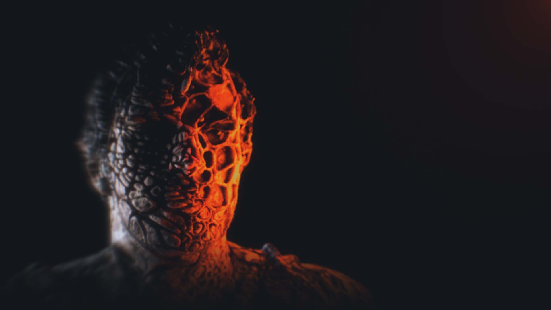
Sam Munnings: The promo aimed to entice the viewer to try make sense of what they’d just watched by giving small dream-like glimpses into recurring elements from the series. Our client, Kill2Birds, was keen to use visual distortions that represented and reflected each character’s role in the series. These needed to be unique for each character, so they wanted the distortions of Karl D’Branin (Eoin Macken) to be a metaphor for his humanistic mental state, all twisted and distorted, while Lommie (Maya Eshet), a cyborg, needed a much harsher digital distortion style.

Seen here in distorted state, astrophysicist Karl D’Branin is one of the main characters on the Nightflyers series.
Kill2Birds
What kind of R & D did you do to come up with the visual distortions?
SM: We were given some time to develop various techniques for distorting 3D geometry and images. But before that we had to build the heads. Some were built from raw scan data that was supplied to us, and others were built by projecting still photos of the actors onto custom meshes. We also had a library of stills of the actors to work with. We explored multiple techniques for building the heads, like using Arnold volumes and images to displace and using cloth simulations and making extensive use of vertex maps. In the end, a lot of the faces were simply driven by varying amounts of image-based displacement maps. Thale (Sam Strike) required much more of a purposeful approach, as his head needed to split into multiple variations of itself. We used the surface and collision deformers inside of Cinema 4D to bridge the multiple head geometries.
Describe the most challenging aspect of the promo.
SM: It was the dandelion explosion at the end. It was really tricky, and we worked hard to create a sinister undertone that fit with the overall feel of the promo. We tried many different ways of simulating, including using cloth, Houdini and [Cinema 4D] X-Particles. In the end, we settled on using multiple X-Particle simulations, which allowed us to get not just the movement we wanted but also the desired feeling that the head was breaking into the seeds.

The promo suggests the crew aboard the Nightflyer will face unspeakable horror.
Kill2Birds
Going back to the series, what scenes were the most interesting or challenging?
SK: The quarantine scene was definitely an achievement of logistics as it was outputting a large body of interlocking work. We created graphics that linked up across several screens within the set for the scene. Playback teams worked in tandem with the shooting crew to realize that scene, which was augmented with VFX. Every bit of that was housed within a very purposefully created set. It was really great to see it all come together so well. That kind of cooperation obviously happened on every episode, but that scene in particular had so many moving parts and the production did a great job pulling it off.

A quarantine is called after a stillborn baby disintegrates into mysterious spores (above) in the ship’s medical lab.
Netflix
Crafts: VFX/Animation
Sections: Creativity
Topics: adobe After Effects cinema 4d Maxon nightflyers particles x-particles
Did you enjoy this article? Sign up to receive the StudioDaily Fix eletter containing the latest stories, including news, videos, interviews, reviews and more.