How the Motion Graphics Director Put the Axis and Allies on a 3D Grid in After Effects
Hazel Baird, director of motion graphics for History Channel's World War II from Space, had never designed a show before that had so much CG in it. But Baird, a freelance motion graphics designer for Prime Focus, was hardly daunted by the challenge of retelling military history with nearly 78 minutes of motion graphics, 300 animations and a disproportionately small segment of talking heads in a tight five-month deadline. The result earned her and the Prime Focus effects team an Emmy this fall for graphic design.
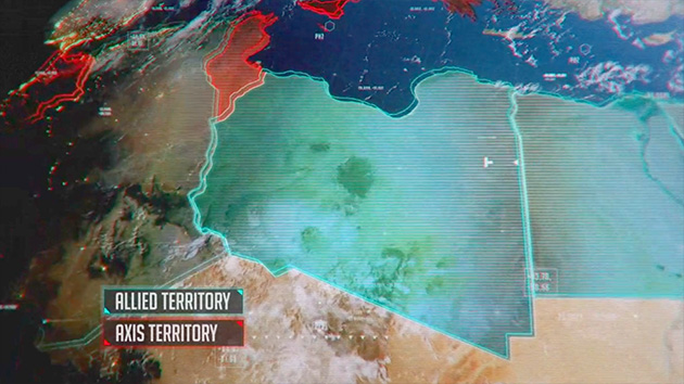
A reimagined history lesson for the digital and video game age, the 90-minute documentary was directed by Simon George and executive-produced by October Films' Adam Bullmore and Matt Robins for History Channel. Led by Prime Focus Creative Director Simon Clarke, the award-winning graphics team included VFX Supervisor Graham Stoot and VFX Producer Vikas Gandhi. The program blends a range of graphic styles, from realistic satellite flyovers of what battles might have looked like from space and digital to Iron Man-like renderings of the insides of battleships and planes as well as flatter, cut-paper styles incorporating old maps and strategic documents. Baird says she unified potentially clashing styles by thinking of it all as connected by an invisible grid.

"With every single style that we did I decided that the way to tie everything together was to put it all on a grid," says Baird. "There were so many different graphic styles used that I didn't want them to look mismatched. I wanted to try and make everything connected, and the best way was to think of the way a grid informs 3D space." Even archival photos got the 3D treatment, giving new life to familiar images of Churchill, FDR, Hitler and soldiers. The points of an XYZ axis and ghosted lines of Baird's grid seem to stretch and float the 2D images onto another plane. "We obviously wanted to make sure the photographs weren't so flat, but using the grid throughout was a way to marry styles that, on the surface, were actually very different," say says.
Baird says early brainstorming with director Simon George helped her map out the visual narrative. "When Simon and I first discussed the script, there were no storyboards or anything like that.The first thing I did was create the storyboards from Simon's notes. He'd say, for example, 'Hazel, I want you to visualize Hitler invading Poland and then going through the rest of Europe.' That was all there was. He initially thought he wanted ten different styles but I told him I thought it was too many and asked to cut it down. Ideally I would have kept it to three styles but we compromised and ended up with six."

Both agreed there would be a highly stylized tech section, and George insisted on a "pop-culture" style reflected in the Japanese invasion segments. Baird says she drew on the sharp contrasts of propaganda posters from the era for inspiration. "I did a lot of research at London's Winston Churchill Museum and was really influenced by the Battle of Britain maps they have there," she says. "When Churchill discussed the movement of the Axis and [the] Allies' response in his war rooms, they actually used blocks to represent British or American or German troops that they would push around on a map on the table. The blocks I use in that segment are meant to replicate that kind of strategic planning."
After Baird designed each section's style, VFX supervisor Graham Stoot went to work building out the CG planes and animating them in a stylized way over still images. "I remember Graham said to me at one point that he was worried his planes looked too computer-y," says Baird. "But I told him it didn't matter because the whole thing is supposed to be a computer-graphics reinterpretation. That's the concept. We weren't going for a photo-real look at all. Of course, we graded those scenes to match up with everything else so the styles held together."

Baird graded her segments in Adobe After Effects, where she had first created them. "I used [Adobe] Photoshop for some of the more map- or document-intensive designs. I also used it to mess them up, make them dirty. I also used a lot of Maxon Cinema 4D, as well. Then I brought them in to After Effects and began to animate the camera moves." Baird was working in the months before Adobe and Maxon released the Cineware plug-in and says the interoperability between the two programs is perhaps "the best thing Adobe has ever done, especially for younger animators and motion graphics artists starting out."
Although the project's initial five-month deadline stretched to eight months of weekend and late-night work—wrapping weeks before the premiere on History Channel on the 72nd anniversary of Pearl Harbor—Baird says it was never a chore. "I really enjoyed it. And I learned so much. It's quite amazing how much we don't know about the war. I didn't know that so many people died, for example, especially in Russia: 25 million compared with 450,000 Americans and 250,000 British. I've heard that a lot of teachers love the film, first because they say their students are more engaged with history visually but also because it drives home those facts in a way that often gets skimmed over in textbooks. You've got to be quick to get your point across these days, but that's something we made sure we did."

Baird's infographics convey these grim statistics in unusual ways. When the narration addresses the number of American and Japanese dead after the attack on Pearl Harbor, a field of eerie, moonlit helmets appears to illustrate the thousands of Americans slain. "The helmet scene on the landscape was one of the first CG scenes I did," she says. "Instead of using just numbers, I wanted to make it epic, so you would feel something when you were watching it and registering the number of dead. I tried to do as many epic scenes like that as I could. I was also thinking a lot in those scenes about graveyards, where it is very quiet but the tombstones silently remind us of all of those gone before."
The group effort of finishing so many animations on time was not without difficulty. "Because I had other designers working with me, the biggest challenge was making sure they understood where I was coming from and designed in the same style," Baird says. "I did end up tweaking a number of things stylistically, so everything looked like the style it grew out of. I knew we were never going to pull it off if everything just looked like it was added on to a different segment that preceded it." Simon George and History Channel, she adds, were thrilled with the final product. "I don't know if they expected it to look as grand as it did. None of us expected it would win an Emmy, either. But that was a nice little bonus."

Crafts: VFX/Animation
Sections: Creativity Technology
Topics: adobe After Effects cineware documentary Maxon motion graphics Photoshop
Did you enjoy this article? Sign up to receive the StudioDaily Fix eletter containing the latest stories, including news, videos, interviews, reviews and more.


Leave a Reply