Chinese Calligraphy Inspired Imaginary Forces' Imagery
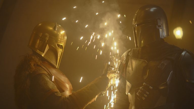
Karin Fong: Yes. A lot of this film takes place in China – it’s about the rise of the Terra Cotta Army. The emperor is coming back to life and he summons that whole army back from the dead, and they threaten to take over.
Steve Fuller: He has control of the five elements, so we took that as a cue. The sections of the sequence are based on those elements. We tried to bring Chinese paintings to life, and to take the story that you’ve seen in the film and create a myth, or a legend version of it.
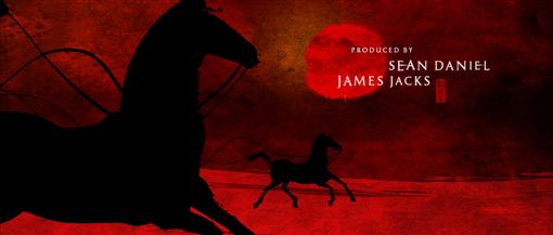
KF: It’s as if you’re seeing a classic Chinese panel painting or scroll painting that immortalizes the tale. It’s a big adventure movie. They traverse a lot of different landscapes. They’re in Shanghai one moment, and in the Himalayas the next. There are mystical beasts like the nian, which is a big Chinese dog-like creature, and there’s a yeti. We’re taking those elements and telling the story the way that Chinese painters might have, in a scroll or panels.
SF: The brush-strokes that you find in those paintings have an expressive quality. Karin and I really liked the idea of simplifying and stripping it down, to highlight the impact of those beautiful strokes. That became the backbone.

F&V: What do you see as background before you start? Are you just reading a script, or do you get to see a rough cut?
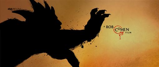
KF: That’s a great question. We design a lot of these special sequences for films – main titles, dream sequences, end sequences – and it’s a question we get a lot. People ask, “Where do you get your inspiration?” And it always comes out of the film itself. For this film, we were able to see a rough cut. But we began with the script. In the first meeting with Rob Cohen, we saw a scene and got a feel for the story. He was looking at classical Chinese art, and it was clear he wanted a level of authenticity to the visuals. From there we read the script. That’s when we drew out those five Chinese elements: water, wood, earth, fire and metal. That’s like the ancient Chinese table of elements. Later, we traveled back to L.A. and saw a rough cut of the film, where you can see how things are shaping up and what sort of things are emphasized. But at that first meeting they showed us a letter M, and it was in a brushstroke style. We were trying to think of how this film is different from the other Mummy movies.
SF: From that [stylized letter M] alone, you could see the direction that Rob was taking this film.
F&V: That was kind of a graphic signpost for you.
SF: It gave us a clue of what he was looking for, and how he saw this.
KF: The other films have an Egyptian theme. So how do you make this one specific to this visual culture? We made storyboards, and that’s one of our favorite parts of the whole process. Having seen the M that Rob that had made with a Chinese calligraphy brush as a sketch, that was what we gravitated toward. And we immediately immersed ourselves in Chinese art and brush paintings so that we could figure out what we wanted to use.
SF: And then it was a matter of, what can we do with that brush-stroke style? How do we push it and make it move?
KF: How do we tell a story?
F&V: What was the director’s reaction?
KF: Rob immediately responded to these boards. We called it an “epic painting” style, and he immediately got behind it. We’re abstracting his film, and it’s so lush, with great special effects – we didn’t want to just duplicate it. And you really need to collaborate with the director and have him behind it. It’s a departure, and a striking visual move that’s different from the film.
SF: Taking the story and doing an alternate visual interpretation is really interesting. It becomes a bonus at the end of the movie. It’s beautiful in itself.
F&V: How close are your boards to the final images?
SF: In this case, pretty close.
KF: You can never be 100 percent attached [to your boards], but in this particular case we mapped it out pretty tightly and we stuck to it. We were lucky that Rob really responded to the shots in our boards. To us, a lot of the exciting things were transitions. You could find yourself in one frame in a blizzard, and in the other in the hair of a yeti. In one moment, it’s a brushstroke, and in another it turns into a dagger. We really storyboarded those out, like you would a graphic novel. We had the angles and camera moves that we knew we wanted.
SF: That’s the fun part – when you think something is one thing, and then it surprises you because it’s something else. That was built into the boards, and it helps the piece have a nice flow through these different environments. They do what the film does – take you on a ride.
KF: Rob has a real respect for Chinese culture and Chiense language. Whatever we did, we wanted it to be authentic. That’s why we had the calligraphy done by a master. The red chops by each of the names are Chinese for, as an example, “director of photography.”
How did you find your calligrapher?
KF: It was actually a friend’s father. He’s in the Bay area, and he’s amazing. I saw him do it in front of me, and he just fills these scrolls with amazing brush calligraphy. He did the characters, and then we actually painted a lot of things.
SF: We also filmed ink running and splattering.
KF: You use ink to texturize them. A lot of them move dimensionally. We wanted that play between something that was painted in ink but yet maybe, as the camera angle turned, you would see a dimensionality and feel yourself in a space.
SF: Karen and I were careful to stay on track with making it always feel painted.
KF: That’s a temptation, right? You can do anything realistically.
SF: You start bringing a couple of 3D models in from the effects studio and attempting to work with them – but we really constrained that and kept it very painterly.
F&V: How about that shot toward the end, where part of one of the characters sort of tumbles upward in 3D space and becomes a dagger?
KF: That’s the character for metal, and we have part of it change and transform so that it becomes a dagger. And that’s an important weapon in the film.
SF: That’s one of our element symbols. You’ll also find four others in there.
F&V: Is that a 3D object or a 2D plane manipulated?
KF: We scanned in [the master’s] calligraphy and manipulated it in 3D space in a 2D program.
SF: This sequence uses a lot of different techniques glued together.
KF: But we like that you have to ask. It’s always a goal, aesthetically and conceptually, that we’re using the tools we have so that you see a character become a dagger, and it doesn’t look like a stock piece. We were playing with that boundary between 2D and 3D.
F&V: Toward the end, is there a nod to a 300-like graphic style?
KF: We looked at a lot of graphic novels. I think we have those inspirations for compositions …
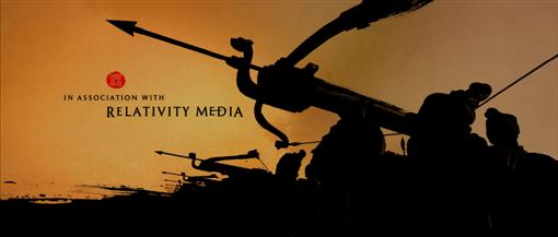
SF: And this contrast of beautiful, silhouetted shapes against painterly skies and backplates. That’s definitely a style that’s graphic-novel-inspired.
KF: The subject matter of an army – the finale of the film is on a battlefield, so there’s definitely a thematic similarity there.
F&V: What program is your workhorse?
KF: Steven and I really love the idea of hybrid imagery. There’s work here in Photoshop, Illustrator, After Effects, Cinema 4D. We used Final Cut. You can’t underestimate ink and paper. And we shot some things digitally.
SF: The ink stuff [drips and splatters] that we shot, you can’t recreate synthetically in any kind of program. You have to do all of those embellishments on the 3D by hand.
KF: There’s a lot of handwork in it. It’s a combination of all those things, and we hope you find it a strong image. People love to ask what programs we use whenever we do a project, and it seems like it’s always a combination of all these programs.
SF: Sometimes you think you know how you’re going to execute something – and it always turns out different from how you planned. [Laughs.] You don’t really know how to do it. And that’s a sign that you’re doing something new.

Did you enjoy this article? Sign up to receive the StudioDaily Fix eletter containing the latest stories, including news, videos, interviews, reviews and more.


Leave a Reply