Company 3 Colorist Rob Pizzey on Making Tim Burton's Characters Pop
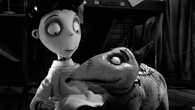
Frankenweenie, which opens tomorrow in U.S. theaters, is in some ways old-fashioned. Shot in color but released in black and white, and animated using stop-motion figures, the film about a boy, Victor Frankenstein, and his (undead) dog actually has its roots in a 1984 short that director Tim Burton made before his career as a feature director took off. Colorist Rob Pizzey, using Blackmagic Design's DaVinci Resolve at Company 3 in London, worked with Burton and cinematographer Peter Sorg to apply an intricate, high-contrast color-grade that ensured the characters pop out from their surroundings.
StudioDaily: Tell us about your collaboration with director Tim Burton and cinematographer Peter Sorg.
Rob Pizzey: They came in about two years ago with a little test — a couple of shots for us to grade. We sat down with Peter and made the picture look great. Tim then turned up later in the day and steered us the way he wanted to go. It's a quite contrast-y look. We filmed-out some tests and he really loved the look of the black-and-white stock. When we actually graded the film, we had to use color negative and color print stock, so we created a LUT to emulate the black-and-white stock from the tests. I pre-graded the film using reference stills from those early tests, and Peter didn't attend at all. He was already shooting another movie.
A month before we started the main DI, I had Tim — well, you can imagine how busy he is, so I had him for about 25 minutes. He made it clear we wanted to emphasize contrast and pull out the characters, to make Sparky, the dog, pop out from the background. I did a first pass from those basic notes. I think it took about two weeks.
Then editor Chris Lebenzon came in for two afternoons and ran through the reels with me. We made a few corrections to scenes. He works closely with Tim and knows exactly what he likes. Tim likes to come in when everything's pretty much done so that he's not looking at shots that aren't fully graded. And he did come in for two afternoons, as well, and made a few teaks. And then we were done. That was the 2D grade. We copied the grade information over once we got the 3D timeline in. I did my correction pass from 2D to 3D and then did it again, with Chris signing off first and then Tim coming in.
It could have been a complete monster, this film. When we won the job we thought, this is going to be so great but so tough. And then we couldn't believe how smooth it went. It was one of the easier DIs I've done. But, having worked with Tim Burton before on Sweeney Todd, I sort of knew what to expect. He's very intense, and he's a fantastic director, so we were all prepared.
Are there any special considerations when you're setting looks for stop-motion animation?
We had to be really careful with strobe effects. Tim wanted a punchy, contrast-y film, but you've got to be careful with black-and-white because if you push it too far you can introduce strobing artifacts. After I did my first pass I looked at certain scenes and found that I had to back off because it was getting a little strobe-y in the highlights. That's not good. We got, finally, perfect shots. And obviously the grading was very intricate because it's black-and-white film with no color at all. You have to play with different shades of grey to make the characters pop out. I was drawing some very intricate shapes, and that was more intense compared to the way I would grade a color film. I used lots of hand-animated shapes and tracking.
Can you give a specific example?
Well, I worked on most of the shots of Sparky, the dog, when he's moving, and Victor's face, to make sure they were always standing out. Certain skies needed some work. Producing as much separation as you can really helps the 3D, as well. In the night exteriors, you have lower shades of whites and greys, so it's tough getting separation in those shots.
Were there any specific features in Resolve that came in especially handy?
What really helped was the automatic tracking software. I know other systems have auto tracking, but on the Resolve it is so quick and so good. It involves a lot of intricate shapes, and you have to track all of them. The ones that wouldn't track I animated by hand, but there weren't too many.
Are all the tools you needed to grade the stereo version built into the Resolve?
Yes, it's very simple. You grade on the left eye, then copy it over to the right eye and make sure all the shapes match up. We did a little convergence pass at the end. Everything was properly converged when it came in, but then the stereographer just tweaked a couple of shots.
Does working on a black-and-white film raise or lower the difficulty level for you as a colorist?
That's a tough question. Certain things are a bit easier. It's fun to work on a black-and-white film, you know. Most everything else is in color.


The first paragraph states the film was shot in black and white. There would be much more to work with in post if it was shot in colour, by adjusting the channels during the B&W conversion. No mention of this in the interview, but I expect this would be the logical way to go.
It was indeed shot in color and graded to black and white. I’ve amended the intro to reflect that.