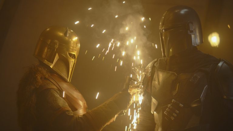
How Cantina Creative Lead Designer Alan Torres and Designer Cisco Torres Dialed it In for Director Denis Villeneuve
Since its inception in 2010, Los Angeles design and creative visual effects studio Cantina Creative has earned an enviable list of credits that includes blockbusters such as Spider-Man Homecoming, Fate of the Furious, Avengers: Age of Ultron, Captain America: Civil War, The Hunger Games, Guardians of the Galaxy, Iron Man 3 and many more.
Recently, Cantina was called upon when Blade Runner 2049 director Denis Villeneuve decided he wanted to refine a couple of major sequences. Using a combination of Maxon Cinema 4D, Pixologic ZBrush and Adobe After Effects, Photoshop and Illustrator, lead designer Alan Torres and designer Cisco Torres (no relation) worked in house at Sony Pictures’ production office for nearly four months.

Cantina designers Alan Torres (left) and Cisco Torres are not related, but they both enjoyed working in house on Blade Runner 2049.
Here Alan and Cisco explain their process for working on site with Sony’s editorial team and how they honed the final looks to match the director’s vision.
StudioDaily: The film was pretty far along when Cantina was called in. What direction did you get?
AT: Yes, we got involved late in the process. Denis was working on further developing a couple of key scenes. His goal was to create a cohesive look that was in keeping with the original film. Our job was to develop and design critical story-related assets and then hand them off to another vendor for execution. We worked in house the whole time, starting with graphical concepts driven by Denis’ vision. Those proof of concepts set the tone for the rest of the look. But even then, that look changed a lot over time.

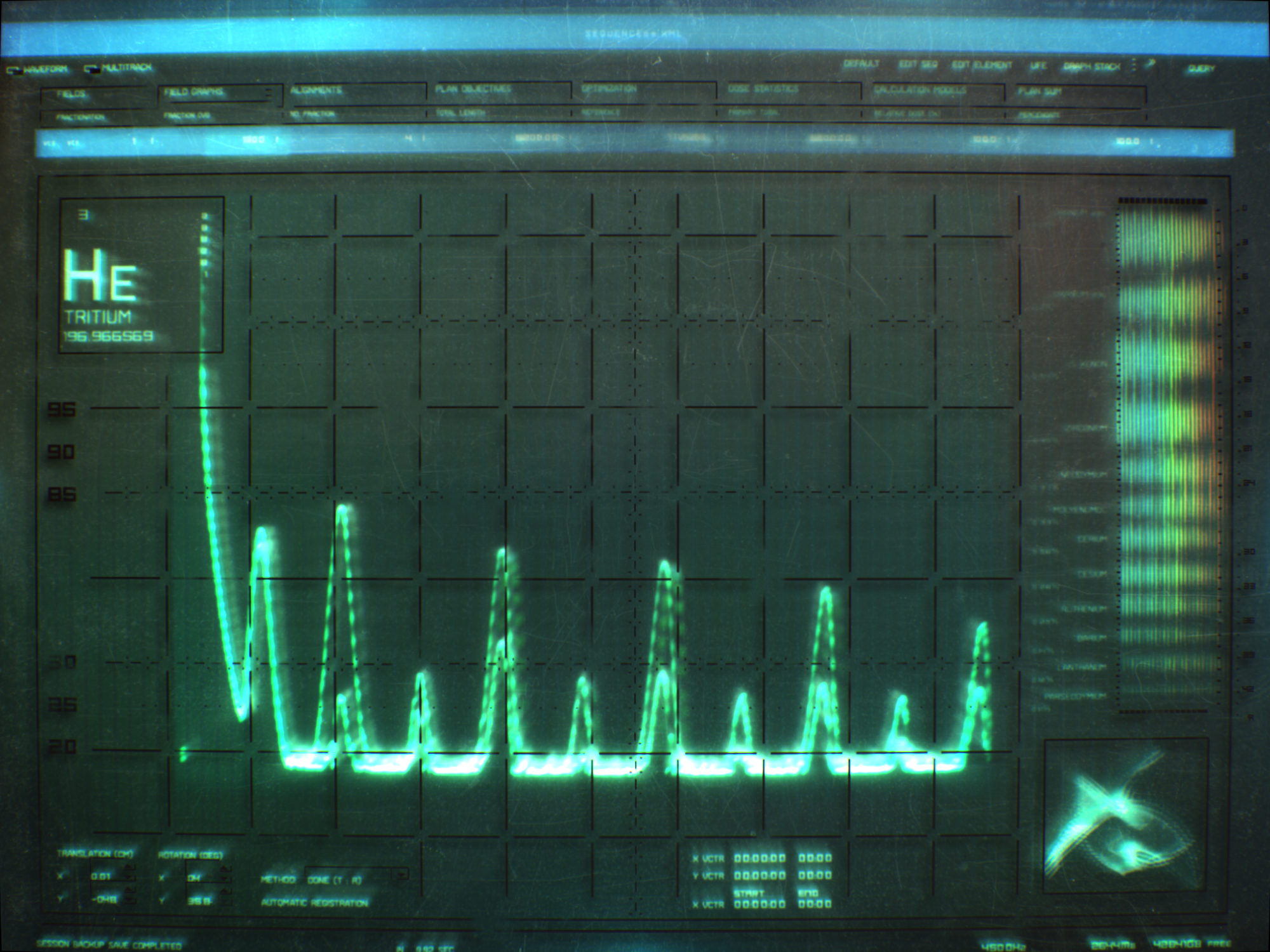
Cantina’s initial look development was on target in many ways, but ultimately became grittier and less colorful.
SD: Before this, had either of you worked with an in-house team before?
AT: No, this was the first time for both of us. I didn’t know what to expect, but I found it to be really efficient creatively, and it was a great experience to work directly with their team. We corresponded almost daily with VFX editor Javier Marcheselli and VFX designer Russell Sadeghpour, and they were fantastic to work with. Creatively, it was a nice change of pace to have feedback just around the corner.
CT: The catering was exceptional. And it was really exciting to work so closely with the editorial team, which allowed us to have an open approach to experimenting with design ideas. They were really receptive to our creative contributions. We were able to efficiently go through a lot of iterations and get feedback multiple times a day.
SD: Describe the Denabase sequence and what they wanted you to do.
AT: In that sequence, Ryan Gosling’s character, Officer K, is manually filtering through tons of DNA slides in search of anomalies. Even though he is processing what he sees at high speed, our job was to refine the slide projector he uses. To get a sense of what Denis wanted, we started out by designing around keywords like retro-tech, grunge, functionality, clarity and dystopian. He liked our first looks, which were inspired by early oscilloscope CRT displays. But he ultimately wanted us to riff off of the on-set designs by Territory Studio, making them grungier and more tangible — something analog that coexisted better with the whole Blade Runner world.

Cantina’s original Denabase designs (left and right) were cool, but more futuristic and polished than the final look they created for the film.

The final Denabase look maintains a balance between the analog, microfiche-look of the machine with retro-tech digital interface elements.
CT: It helped that we had the original movie as inspiration for thinking about 1980s tech and what that style would be like. We modeled everything and did all of the texturing, lighting and animation in Cinema 4D. I think this project really reinforced, for me, the value of paying attention to detail. And not just detail in our design work, but details in the story-based reasoning behind why a certain interface needed to look that way it did.
Did you try any new strategies or tools while working on this project that you think other artists would want to know about?
AT: Yes, this was the first time I’ve used C4D’s Take System, which allows you to create multiple variations of any renderable attribute in one file. We mostly used it for texturing and lighting variations, which were a key concern for both the Denabase and morgue sequences. It came in really handy and helped us pump out a lot more versions and improve our workflow.
Tell me about the morgue sequence and how you handled it.
AT: In this scene, characters are interacting with dials and knobs as they examine a set of bones. Officer K spots an incision on a bone that the doctors miss, so he magnifies it and finds a serial number. It’s a massive plot point in the story. We worked on the back end of the sequence, which needed to be a pretty iconic moment — like when Harrison Ford finds out what he thinks is a fish scale is actually a manufactured snake scale in the original film. We used Cinema 4D to mock up a low-poly surface crevice that would be the incision, and then we brought it into ZBrush and added details and texture to make it rugged, like the surface of the moon. We made three different versions and showed them to Denis. He signed off on the look pretty quickly, but the biggest challenge was the framing of the shot, which went through maybe 20 different versions.
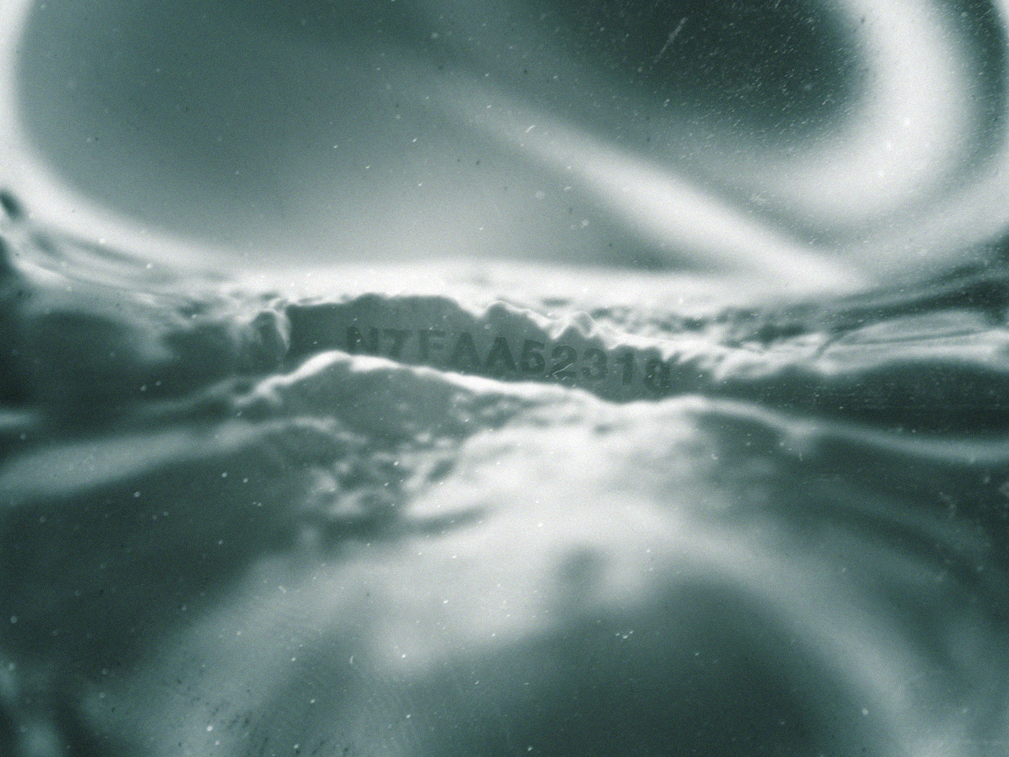
An early version of the look for the serial number found etched into bone in the morgue sequence.

This look, which was used in the film, matched Director Denis Villeneuve’s desire for the feeling of an MRI machine scanning an underwater surface.
You went through a lot of different iterations for each part of this project. What was that like?
AT: It’s true that our creative mindset shifted in a lot of different directions for this. One good example of that is a scene we did where Ryan Gosling’s character has a wooden horse and he wants to find out more about it. He goes to the office of a guy named Doc Badger, where they scan the horse to find out where it came from. We started out with something that was rough and almost unreadable and then switched to a more refined UI that Denis felt was way too complicated for a guy like Doc Badger to have. The art direction ultimately came down to refining what the established technology in the world would actually allow.

Early versions of Doc Badger’s scanner were rough looking and didn’t have quite the right feel for the film.
CT: Yeah, Doc Badger works out of a grimy, cluttered basement hallway, so you had to think: ‘What would he actually have down there to work with?’ Like we did with the slide projector in the Denabase sequence, in our design process we had to balance the physical aspects of the machine with the digital aspects of the interface.

As the design process moved on, the scanner’s look became too complex. In the case of the final design chosen for the scanner, below, less turned out to be more.
AT: The look Denis chose is a testament to less is more. I’ve never had a first version of anything get picked, and you have to get used to that as an artist. You might be attached to your work, but you have to put your own creative endeavors aside and work with everybody to make the point of the story that’s being told clear. It’s funny how, on most movies, you’re trying to make the biggest, brightest, clearest design but for this movie it was the opposite because of the world we were trying to coexist in. The tech in this film could only do so much, and we needed to design with those limitations in mind.
Did you enjoy this article? Sign up to receive the StudioDaily Fix eletter containing the latest stories, including news, videos, interviews, reviews and more.