Kerry Hayes
How Design Helped Story in Collaboration with Guillermo del Toro
Paul Austerberry was excited and terrified simultaneously when he was told in 2015 about Guillermo del Toro’s “then-untitled fish movie.” What eventually became a current awards’ season darling, The Shape of Water, was originally discussed with Austerberry as “Guillermo’s passion project — a small black-and-white film. I was a bit terrified, because color is pretty important as a tool for design, to tell a story.”
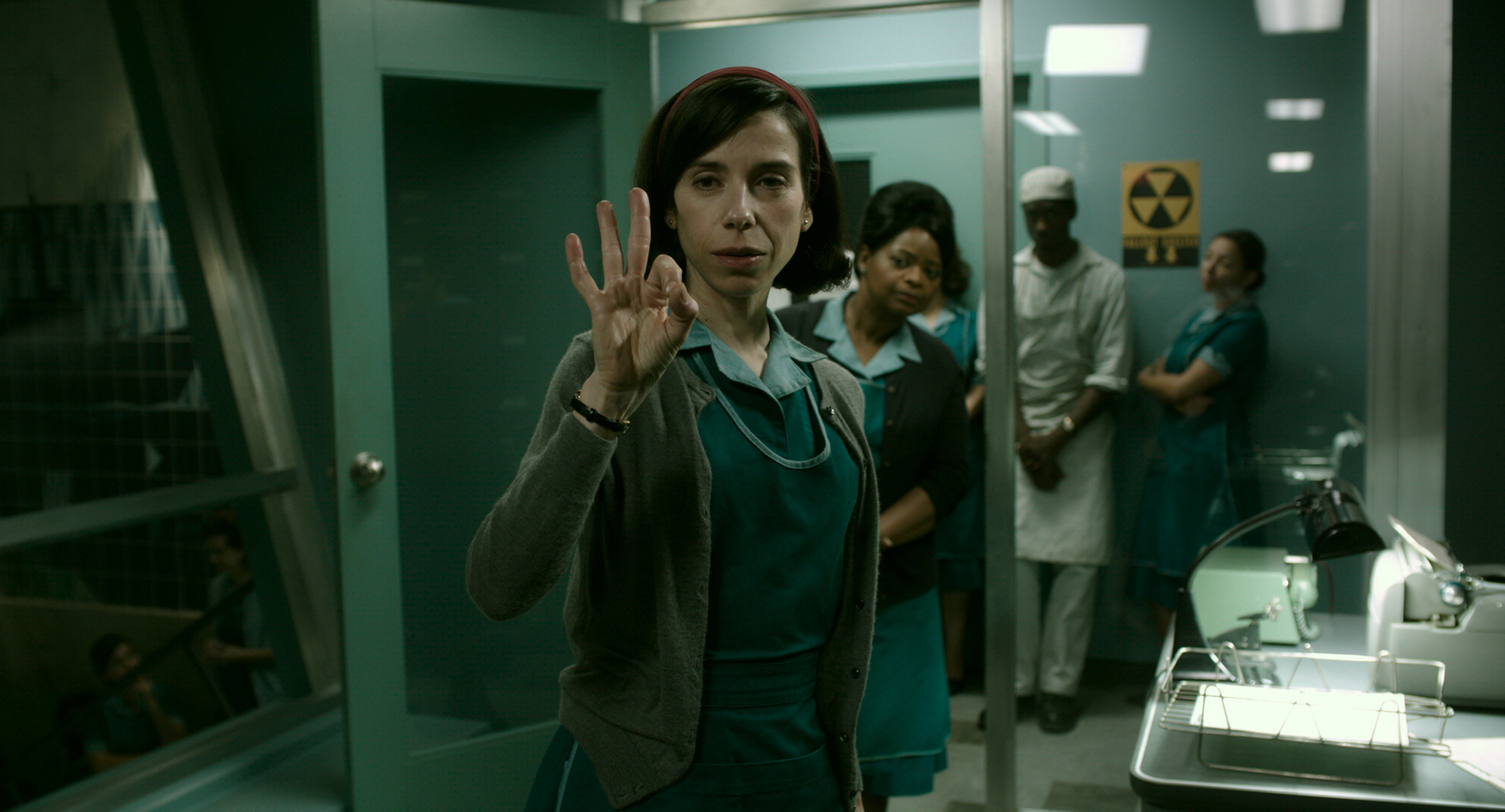
Nevertheless, Austerberry forged ahead, and then Fox Searchlight signed up and offered a bigger budget, transforming the project into a color film. Nevertheless, a ream of design challenges lay ahead. The movie is a genre-mixed Cold War-era thriller on the one hand, and a romantic and mysterious fairy tale on another about a Elisa (Sally Hawkins), a mute cleaning woman who discovers, at the height of the Cold War at the facility where she works the night shift, that the government is experimenting on a reptilian fish-man (Doug Jones) discovered in the remotest part of the Amazon. And then, she falls in love with it, setting in motion an incident with international implications.
In that sense, although there is plenty of intrigue about whether the creature will escape, be killed, or be used to further military ends by either Americans or Russians, the movie nevertheless transforms into a tale about character Elisa’s environment compared to the austere military base where the creature is kept — and to the romantic vision she has of her mysterious lover’s underwater world.
Audio-only version:
Subscribe: Apple Podcasts | RSS
Along the way, Austerberry recently told Studio during a conversation for the Podcasts from the Front Lines series, the design-obsessed del Toro “wanted to evoke an older style of filmmaking — a contemporary tale, yet told in a period setting, if that makes sense.”
Elisa’s apartment, where she and her lover would eventually take literal and figurative refuge, became, to Austerberry’s mind, the physical manifestation of the film’s title — shaped, as it were, by water, from the warped wooden floor to aquatic-style wallpaper and paint, and also a cold, blue-and-cyan lighting scheme. Sitting on top of an old-fashioned movie palace, and based on Toronto’s Massey Hall, the building features ornate 1890s architecture, a gigantic arch window shared with a neighboring apartment that was specifically based on a window seen in the 1948 film, The Red Shoes, and many more tiny detailed items designed to enhance this theme.
“We wanted to keep that notion of an aquatic environment throughout the movie in her apartment,” he says. “There the color tones are all sorts of blues and aqua kinds of colors. It sounds corny, but I always refer to her apartment as being literally shaped by water.”
The government lab, by contrast, is presented in a green, industrial form based on Brutalist concrete architecture. The home of antagonist Strickland (Michael Shannon), on the other hand, is presented as a stereotypical, early 1960s dream home. Green represents a cold, uncertain future, while red represents love and romance, and those are just two examples of the strategic manipulation of color woven into the film’s design.
Austerberry explains it all in great detail in this month’s Podcast from the Front Lines.

Sally Hawkins and Doug Jones in The Shape of Water.
Photo by Kerry Hayes. © 2017 Twentieth Century Fox Film Corporation All Rights Reserved
Crafts: Shooting
Sections: Creativity
Topics: Podcast Podcasts from the Front Lines color Guillermo del Toro podcasts from the front lines production design
Did you enjoy this article? Sign up to receive the StudioDaily Fix eletter containing the latest stories, including news, videos, interviews, reviews and more.