Filmmakers live in a digital world. Figuring out how updated procedures can replace older technology is part of the game when it comes to quality and efficiency. That's how file-based workflows superseded tape, and how the on-set digital lab is transforming traditional post processes. Still, there's one aging technology that filmmakers probably haven't spent much time thinking about — the lowly Courier.
I'm referring not to sneakernet systems for moving media from facility to facility, but to the font. Courier is a standard in Hollywood, but one with roots in the analog 1950s. And, lucky for filmmakers, there's now a free alternative.
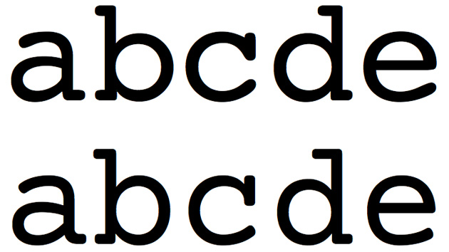
Courier is a monospaced typeface, meaning that, for any given point size, each letter is the same width when printed on a page. The letter i takes up just as much space as the letter w. No typesetting procedures like kerning are used to close up extra space between letters. It was the standard typeface used by the IBM Selectric II typewriter, which made it the default typeface of novelists, scriptwriters, and creative typists everywhere. It's pretty easy to read, even at arm's length. And It's royalty free, which helps explain why it's endured as a standard even in the age of sophisticated word processors and scriptwriting software.
But screenwriter John August has spent a lot of time thinking about Courier, and he's convinced that we can do better.

The latest entry at August's blog, Introducing Courier Prime, features a brief history of Courier that helps explain why he commissioned a new, Courier-esque typeface last summer. He wanted one that would match the broad specs of Courier, so that a script page printed with the new font at 12 pt would have the same line and page breaks as one printed in Courier at 12 pt. But he wanted one that didn't look as "blobby" as the creaky Courier, that was easier to read, and would have a more elegant italic face. He went through 25 design iterations, testing sample screenplay pages on working screenwriters each time. The resulting TrueType font, Courier Prime, was released yesterday under a "very liberal license" that August hopes will encourage its use in iOS and Android apps. (A webfont version is said to be coming soon.) Just be sure to read the warning in the FAQ about an incompatibility with the default font in Final Draft for Windows.
I'll mention one more time: it's free.
How are the results? Pretty slick. The letters are easier to read and no longer have that retro feel associated with long documents set in Courier, though the difference is nowhere near significant enough to make anybody mistake you for a newb who doesn't know how to format a script. To some degree, the advantages are intangible — but it's a smart upgrade that might help give your next project that certain je ne sais quoi.
Did you enjoy this article? Sign up to receive the StudioDaily Fix eletter containing the latest stories, including news, videos, interviews, reviews and more.
