How Amazon's Hot Streaming Series Shot with Canon's C500 and Got a 4K Finish at Light Iron
Is Transparent set to be the first breakout hit for Amazon Studios? The new show, created by Six Feet Under and United States of Tara veteran Jill Soloway, generated an enormous amount of buzz in advance of its premiere, 10 episodes at once, on Amazon Instant Video this Friday. The show stars Jeffrey Tambor as a family patriarch who, in the series pilot, announces to his children (Gaby Hoffman, Jay Duplass, and Amy Landecker) that he is transitioning from male to female — from Mort to Maura. The series weaves together multiple story threads following Maura and other members of the family as they deal with this disclosure, and makes liberal use of flashbacks to fill in the narrative. But pre-release publicity has focused on the show's quality as much as its subject matter. The New York Post ran a headline calling Maura the role of Tambor's career, and television critic Alan Sepinwall wrote that Transparent is "the best new TV show debuting anywhere this fall, by a long stretch."
")
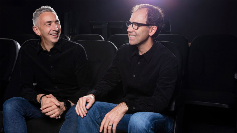
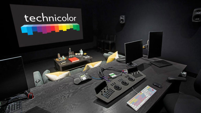
Jim Frohna and Corinne Bogdanowicz at work on Transparent at Light Iron in Los Angeles.
Soloway's vision for the show is bolstered by her collaboration with cinematographer Jim Frohna and colorist Corinne Bogdanowicz, both of whom she worked with on her 2013 feature film, Afternoon Delight, which won the Directing Award at the Sundance Film Festival. Light Iron provided an Outpost mobile dailies system for the production, and the 4K DI has been executed by Bogdanowicz at Light Iron in Los Angeles. On the eve of the show's premiere, we asked Frohna and Bogdanowicz about their creative and collaborative process, and how they created a classic look that would set the tone for a very contemporary story. Watch the trailer, below, then read on for the two Q&As.
Cinematographer Jim Frohna

Jim Frohna
StudioDaily: What kind of discussions did you have with creator Jill Soloway about the look of Transparent? Did it help that the two of you had worked together previously?
Jim Frohna: Jill and I first worked together on the feature Afternoon Delight, which ended up winning the Best Director Award at Sundance 2013. We shot in a fairly naturalistic style on the feature and wanted to push further with Transparent, both in the look and the feeling. I tend to light for the space and not just the actors, and typically through the windows. Furthermore, we rarely give the actors marks to hit. For both Jill and me, it's worth giving the actors the space, to not clutter it up with gear. This means the actors can use the whole room and, I, as the camera operator, can follow them anywhere. It's a freeing way to shoot and feeds right into the main goal of having things feel as authentic and real as possible. As far as inspirations, we looked to the films of John Cassavetes and also to the work and emotional exploration of the late choreographer Pina Bausch.
What camera did you shoot the pilot with, and how did you select the C500 for the series?
On the pilot we shot with the ARRI Alexa, which had been my camera of choice for all my work. But for more intimate scenes, we opted for the Canon EOS C300, again bearing in mind the goal that the machine of filmmaking be as low-profile and unobtrusive as possible. I cradled the C300 in my hands and pulled my own focus. Jill loved the look of these scenes in particular, as did I.
As we began to prep for the series, Amazon Studios announced that all shows had to be shot 4K. I knew the EOS C500 was an option, but I still decided to test the Canon vs the [Red] Epic and the [Sony] F55. The test only confirmed what my gut and eye already knew– the C500 had a cinematic look to it — the way it interprets colors is what reminds me of Fuji motion picture film — and was the right way to go for Transparent.
The other significant reason for the C500 was size. I shoot almost all handheld and wanted the lightness and flexibility of a lower-profile camera. We had three camera bodies, two in studio mode and the third in a bare-bones stripped-down mode, which we dubbed the "Intima-C Cam." I would often grab that camera in between takes and shoot some cutaways, or I'd catch an actor, unaware that I was rolling, in a particular pose or compelling, quiet moment. The small size of the C500 made grabbing those moments possible — and those extra images or character moments, more often than not, ended up in the final cut of a scene.
What kind of challenges does shooting 4K pose? Does it make you extra-picky about lenses? And did it inspire a different approach to filtering?
As with any digital workflow, there are certain challenges, little gremlins that pop up to mess with you. We learned a lot in the first week of shooting — things like how often the camera needs to cool down before the fans kick in. Or the need to double-check the external recorder, which has no obvious indicator that it's running. Or how to best rig all the batteries, external recorder, etc for the kind of freeform, 360-degree handheld style of shooting that I do, often for 20-minute takes or longer. Perhaps one of the bigger challenges in the overall workflow was the size of the 4K files. It's an adjustment that has to be made in terms of hard-drive space as well as in post, working with the big files.
The fun for me, as 4K continues its march forth, is learning and playing around with the new technology, where the limits are and what possibilities are now out there. This was especially true with the C500 — learning how it reads colors and light and, particularly, how far you can push the image in low light. The sensitivity and resolution of this camera is amazing. For example, I typically shot night scenes or driving scenes at 2500 ISO and the image, instead of falling apart with digital noise, actually acquired a texture that reminded me of film grain, and it looked great. There was one night driving scene down Sunset Boulevard that we shot at 4000 ISO and, while the image held up, you could see way too much. There were no blacks, no true shadows, and it looked like some surreal neon dreamscape.
As far as lensing, both on this project as well as other narrative and commercial work, I've been more and more drawn to using older lenses to bring a little character, some texture, into what can be a very pristine image. Between the older lenses and the fact that we shot many scenes at a 2.0 and a bunch wide open at 1.3, the look felt very cinematic and very far from that potentially clinical digital look. I don't use filters, outside of ND and a Pola, as part of my "keeping things real" approach.
Light Iron tells me you used their Outpost on-set system for dailies. Can you explain a little bit about that workflow, particularly anything unusual from your perspective?
Honestly I was so caught up in shooting/operating that I put total faith in Peter Brunet, our DIT, and the Outpost system. I had conversations with him at the start, and then trusted all was well unless told otherwise. It was smooth sailing throughout the shoot.
Talk about working with colorist Corinne Bogdanowicz on the 4K DI.
I first worked with Light Iron and Corinne on Afternoon Delight and Corinne did a great job. She's very low-key and really knows her stuff, and she's also fast, which this time around we needed for the insanely fast post schedule on Transparent (we wrapped photography on Aug 8 and the full series launches Sept 26). The pilot was done at Keep Me Posted, but for the series, Jill and I made a push for Light Iron. Not only because of the love you feel from the whole team, including [Light Iron executive producer] Emily Eddey, but also because I knew Light Iron was pretty much at the forefront of 4K post and had done extensive work with projects shot on the C500. It was another fantastic experience. Corinne and Emily handled all our post needs, under crazy time pressure, with grace and professionalism. And the show looks really great.
How much of your look was realized in camera, and how much was finessed in post? Were there any challenging shots or scenes that really came alive in the color grade?
In the overall look, I shoot and light in a straightforward naturalistic way and thus I am shaping the look on set and in camera. However, there was one significant creative challenge for the series, which was defining a look for the many flashback scenes that are sprinkled throughout the first season. The show is a contemporary show and the flashbacks are from the late 1980s and early ’90s, which is not that long ago, really. It's not like we're back in the Kodachrome ’50s, to give one fairly cliched example. Rather than try to define what imagery, photography or video might have looked like back then, Jill and I ended up talked a lot about creating the feeling of memory, which led us toward a sort of faded, desaturated, look that would work well in contrast to the rest of the show. Corinne really understood and embraced the challenge and helped us define what I think is a particularly unique, not-quite-done-before style of flashbacks.
As a cinematographer, do you always manage to be closely involved with the final color grade on a project?
I will always want to be closely involved with final color. I actively advocate for myself and other DPs to have final color as part of our contracts and to have the producers budget that into the deal. It is, after all, a critical and essential part of the creative process. It's the last push before your baby enters the world.
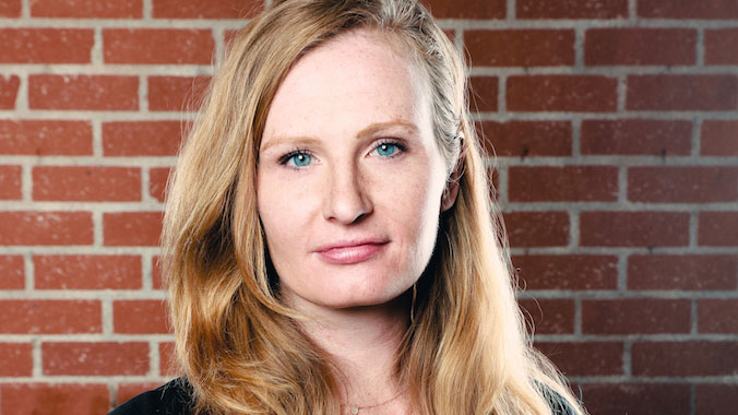
Colorist Corinne Bogdanowicz

Crafts: Post/Finishing Shooting
Sections: Creativity
Topics: c300 C500 Canon corinne bogdanowicz jim frohna light iron
Did you enjoy this article? Sign up to receive the StudioDaily Fix eletter containing the latest stories, including news, videos, interviews, reviews and more.


Leave a Reply