How He Worked with Director Todd Haynes to Re-engineer the Cinematic Look of the 1920s and 1970s
A mirrored and intertwined tale of childhood trauma, escape and discovery, Wonderstruck is also director Todd Haynes’ homage to 1970s cinema and black-and-white silent movies. Based on the Brian Selznick novel of the same name and shot on location in New York and its environs, Wonderstruck tells the story of two deaf children (one born that way, the other by recent accident) in two tonally different time periods, both largely devoid of dialog. We spoke with Haynes’ longtime director of photography, Ed Lachman, ASC (Carol, Mildred Pierce, Far From Heaven), about the choices he and Haynes made. From lighting to film stocks, Lachman and Haynes keep the parallel story lines grounded in the quiet reality of pre-technology childhood, buoyed by the magic of human connections and hope.
StudioDaily: You shot on Super 35 film for most of the movie but the later stop-motion scene, which goes back to Haynes’ roots and Superstar: The Karen Carpenter Story, was shot on the Alexa Mini. Did you use digital cameras anywhere else?
Ed Lachman: We used digital cameras in two areas. One was in the [American] Museum of Natural History. We were really limited by how much equipment we could bring in and out of the museum every day. We couldn’t, obviously, leave anything there overnight. That really limited the lighting, first of all. But I had to winnow down my regular camera equipment, too. I had done tests on film, originally, and I could have shot in there with a stop to a stop-and-a-half push, wide open. But then Todd finally said, “Well, let’s just shoot digitally in here.” I had worked with LiveGrain digitally on Todd Solondz’s film Wiener-Dog (2016) and I experimented with it then. What’s unique about this in-camera process is it tracks [the] digital file in its highlights and shadows, affecting the size of the grain. The problem, before, of adding grain to the digital footage to make it feel more like film was all it was was just an overlay. It didn’t track the different frames in exposure when you move the camera and the light or a person is in a different place. This tracked the exposure in the frame with the size of the grain — the finer grain for the highlights and the larger grain for the shadowed detail. It had a real filmic feel to it. To me, the difference still between digital media and film is the color depth. There’s just so much more in film. That’s why we shot the rest of the film with Super 35.

Jaden Michael, Oakes Fegley, and Julianne Moore in WonderStruck.
Photo by Mary Cybulski.
SD: The two time periods in the film — the 1920s and the 1970s — are each true to their filmic era in terms of texture and tone. How did you approach the silent-era segments?
Because we were representing the cinema of the 1920s, we knew we had to shoot actual black-and-white film. It was a unique experience for us. We found the film stock we wanted, Double-X Negative, and it was in Kodak’s catalog, but they actually had to make the stock for us. So then I had to get a lab, which was incredible. FotoKem dedicated one processor for me to develop it. The language of that period we pulled directly from Murnau and King Vidor, and then our film-within-a-film, “The Wind,” was our little early [Lillian] Gish and [D.W.] Griffith homage. That one was shot at 1.33:1. I found when shooting I’m Not There, which we shot on negative, that the exposure, latitude and grain structure of black-and-white film stock is totally different to my eye. It was the only choice for this story, despite the hurdles.
What did you shoot the rest at?
That’s the one thing Todd really wanted: a fluidity between the black-and-white, the 1920s and the 1970s scenes. So we decided to shoot mostly in 2.40:1. But in the museum, we simply needed the expediency of the digital process. I still could have shot with film but it was definitely the right decision. Another thing we had going for us there is the digital world loves low light, and that’s what we had to shoot inside the museum. I don’t like digital in the mid-range of exposure or in exteriors, even though it can be very good, especially if the story demands it. We shot the stop-motion sequence in the Queens Museum, in its New York City diorama. Beyond the stop-motion aspect of the process, we needed to shoot that digitally, with macro lenses, because the space could only handle really small rigs. We had to come up with the truly smallest profile of camera possible. In addition to the stop-motion sequences, the long shots of the characters were also shot digitally. I had a second unit, led by Ivan Abel, doing the stop-motion work and Todd and I supervised him. But because of the LiveGrain, I really don’t think you can make the distinction between the film and the digital images at all.
Where did you shoot the museum’s back-room hideaway that the boys inhabit in the 1970s segments?
That was on a set, so we weren’t limited by the museum hours.

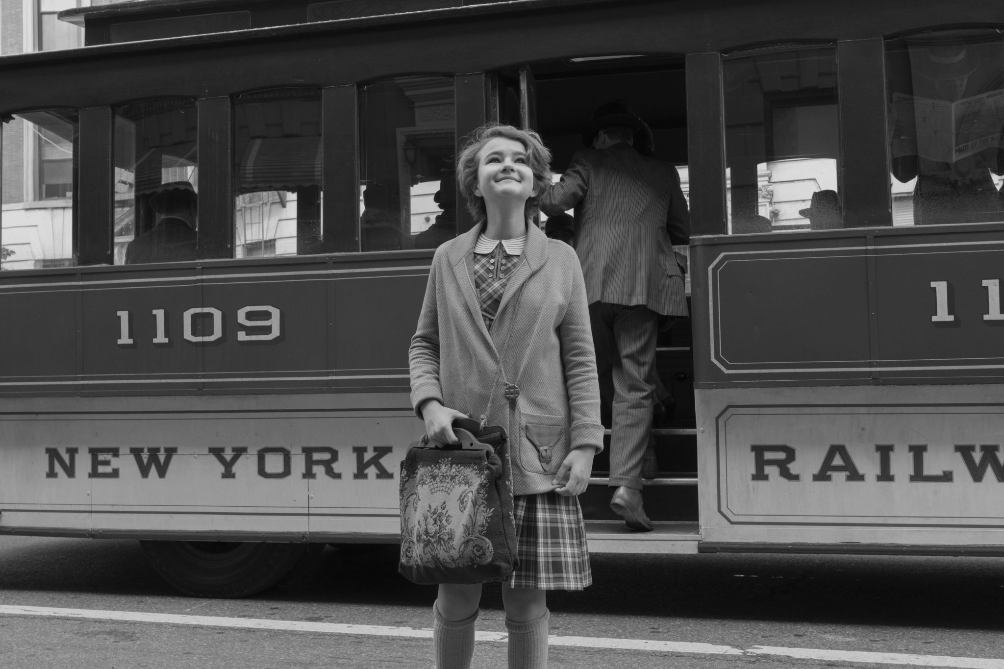
Newcomer Millicent Simmonds, who is deaf like her character, in the film’s 1927 black-and-white storyline.
Photo by Mary Cybulski.
You filmed up the Hudson (Peekskill stood in for Hoboken, N.J.) for black-and-white scenes but also in Manhattan for many gritty establishing shots in the 1970s. Did any of the locations prove challenging?
We were up in Harlem for those scenes. The hardest for us in terms of New York locales was, where do you shoot the Port Authority? It’s where Ben first arrives in the story. We had way too many restrictions in the place itself, in terms of area, so we ended up in a warehouse on the docks on the West Side. I think it was one of the cruise line shipping areas. It already had those low ceilings, but I had the art department build those rectangular, fluorescent fixtures overhead. See, I’m old enough to remember what Port Authority was like in those days! The exterior of the terminal for us was on Flatbush Avenue in Brooklyn. We redressed the street for the 1970s, and that was the most expensive day of shooting. They told me later it was like a million dollars, but we had to, for the story. Another hard part was approximating the time of year in camera. It’s supposed to be a hot and steamy summer day. The actual day was extremely overcast. I did everything by overexposing the negative. Later, however, the sun did come out. The feeling of the 1970s on film, we agreed, is it has this yellow-green shift. And I remember the film stocks back then: it was Kodak 5254 ASA 100. Today, we shoot daylight stocks of 250 or even 500. When I took a harder look at examples from that era, I saw that what they would do is push the film to get more exposure. But the chemistry of the actual film had a tendency to create a yellow-green and also magenta shift in the shadows, and a kind of yellow tone in the highlights. For larger print orders back then, the studios were printing on more inexpensive stock from Fuji. The Fuji stocks in particular had these color-shift tendencies. So I mimicked that color shift, playing with color temperatures. I came to refer to it as kind of the jukebox color palette, with the mixed lighting sources playing heavily into it as well.
We’ve discussed before how the work of still photographers influenced the look of Carol. What were some of the inspirations for this film?
Todd always likes to play with references in such a richly layered way that encompasses cinematic language, history, fashion, art—all of it. The still photographers of that time period we referenced were Mitch Epstein, Richard Misrach, Joel Sternfeld, and obviously someone we’ve touched on before like Saul Leiter, with his fantastic street photography, which is an art form all its own. For the cinema of 1929, we were referencing the height of silent pictures from about 1927 on, so this sense of prosperity and hopefulness is part of every shot: the wonder of seeing a city in growth, as Rose sees from her point of view. For the 70s, in contrast, which was a time of economic turmoil, I wanted to show the hardship of the images and the grit of the street. Of course Midnight Cowboy, actually 1969, but The French Connection. Those films were so different from the kinds of films Hollywood was making at the time. We wanted to use the same tools, like shooting in different locations, using a western dolly, using a zoom lens for visual punctuation. For the stop-motion, we actually looked at a lot of Joseph Cornell’s boxes. Those were mini theaters of the mind and subtle reflections of desire and reflection. I’ve always loved his work, so that was a real joy to go back and look at them more deeply.
How did author and illustrator Brian Selznick’s beautiful original book play into this?
Todd broke it down simply like this: Brian’s illustrations became the cinema of the late 1920s and his words became the 1970s color scenes. Brian also wrote the screenplay, so he got to jump into another layer of his original world through the language of film.
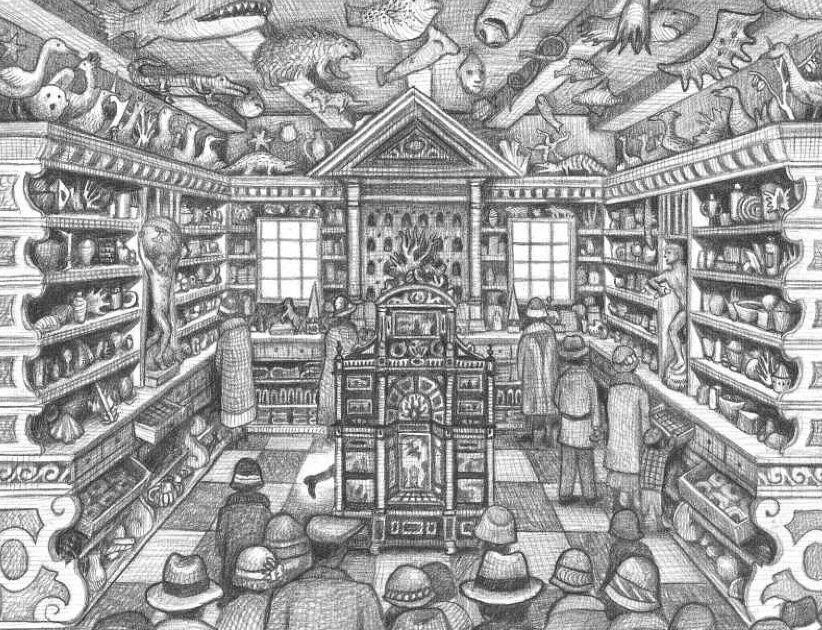
A drawing from Brian Selznick’s book that inspired the film.
A book can suspend time indefinitely, depending on the reader’s whim. But a film lives or dies by its pacing.
The editing by Alfonso Gonçalves [Carol, True Detective] was key. He’s wonderful, especially the way he married the film’s two worlds. The music of Carter Burwell [Carol, True Grit, Fargo] played another critical role. Also, this idea of suspension appears in the scenes of the 1970s. For Rose, the character in the 1920s, her world is mirrored in her deafness. Ben is a hearing child who becomes deaf, so in a way, we wanted to create how the objective world becomes the subjective in his inability not to hear. We used devices to convey what you’ve identified as the suspension of time, which functions differently in a written story. For us, that translated to long tracking shots on pneumatic tires on the western dolly; overcranking the film and shooting it slightly off speed; also using longer lenses. These were all ways we were trying to implement, even in Rose’s world, how you hear through images. We wanted the viewer to experience a world much different from their own. The whole film is like a silent film, even in the 70s sections. The music and sound design provides the natural punctuation.
What lenses did you use?
I have a set of Cooke Speed Panchros that I had rehoused by a very good company in London called TLS — True Lens Services, not to be confused with the Times Literary Supplement. They use the same mechanics as the Cooke s4s, so they work much better than the originals but you get that great original glass. I actually still had some Cooke and Angenieux zooms from the 70s and 80s. Here’s an interesting thing: I found out from Angenieux that the old glass in these lenses had more lead in it back then, and that probably captured a somewhat different feeling in the contrasts. So I used my 20–100 [and] 20–60. They’re slower lenses, like 3:1. Then the 25–250 was an Angenieux T3.5 HR lens.

Director Todd Haynes on set
We seem to be having a 1970s renaissance in films at the moment.
Yeah, Hollywood’s been talking about the 1970s ever since. So many filmmakers see that as the liberating moment. Experimentation reigned supreme, from both the way stories were told to the style in which they were presented. What I find, which is a bit weird, but some directors are looking at the wrong sources to really understand what the looks are of the period. I’m referring to this fascination with VHS, and how some directors first saw these films. But that’s not the original source: you have to look at the film to see what they were doing. You can’t look at VHS tapes to figure that out.
What, for you, does the film ultimately convey?
Every segment captured the vast and varied imaginations of the children it portrayed and the idea of things being handmade. The effects in the film, other than some cleaned-up backgrounds when we were shooting exteriors, were minimal. We didn’t want to create a period film with today’s technology, and so we wanted as much as possible to do it in camera. Stop-motion animation is a very old technique. In Rose’s world, in particular, we watch her doing those paper cutouts and assembling her scrapbooks, and they all become references later in the film when they end up at the diorama. It’s really about making this collective memory, which we all have, visible.
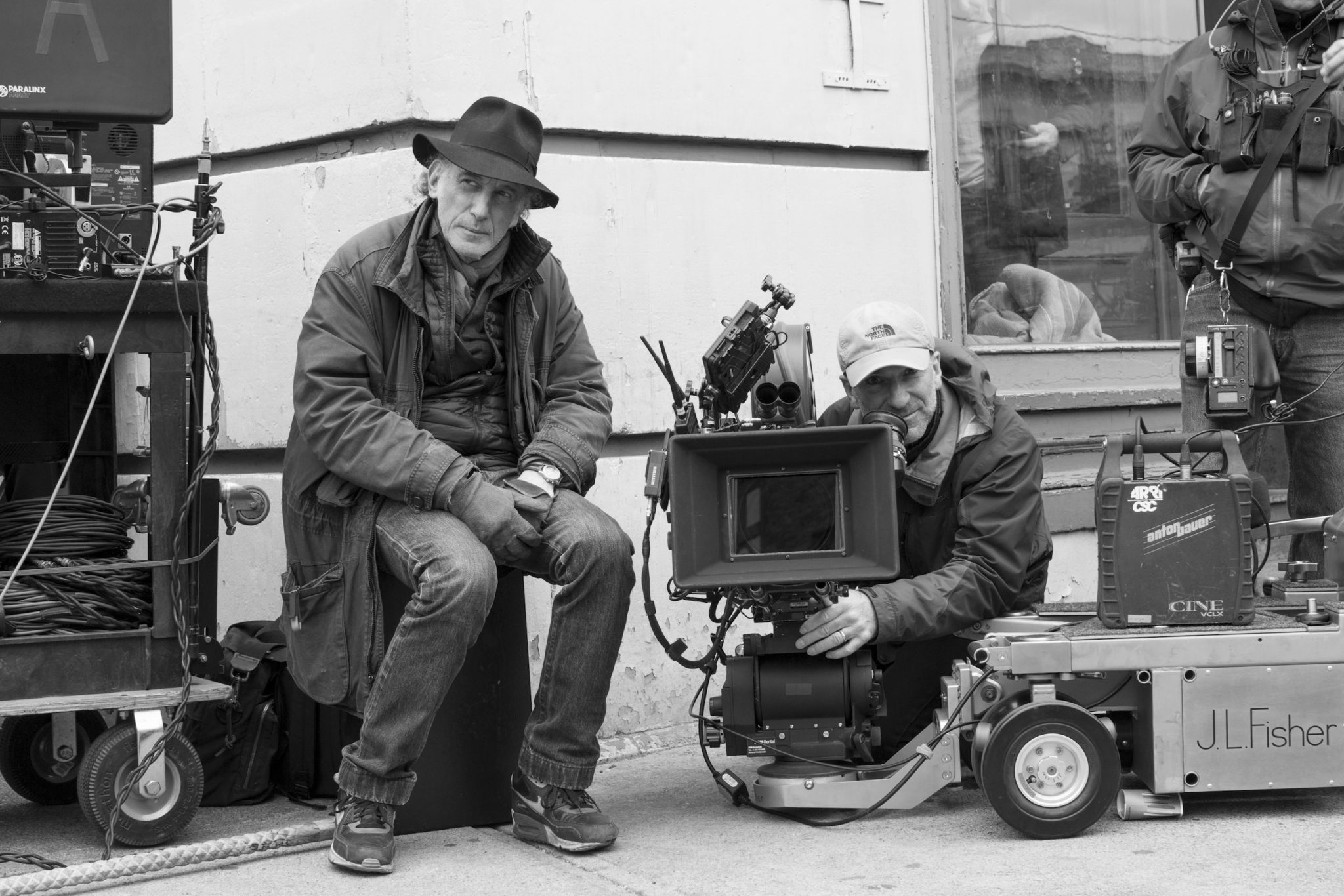
DP Ed Lachman and B camera operator Peter Agliata
Crafts: Shooting
Sections: Creativity
Topics: Feature Project/Case study Q&A 1970s cinema Cinematography livegrain
Did you enjoy this article? Sign up to receive the StudioDaily Fix eletter containing the latest stories, including news, videos, interviews, reviews and more.